Stay ahead with the latest tips, trends, and insights from the Titan Blue team , straight from the studio in Broadbeach.

A great law firm website is so much more than a digital business card. Think of it as your most dedicated employee—the one working 24/7 to turn casual online visitors into genuine, paying clients. Getting it right involves a deep dive into your target audience, a crystal-clear value proposition, and a sharp focus on business goals. The result? A platform that not only builds trust but actively drives firm growth.
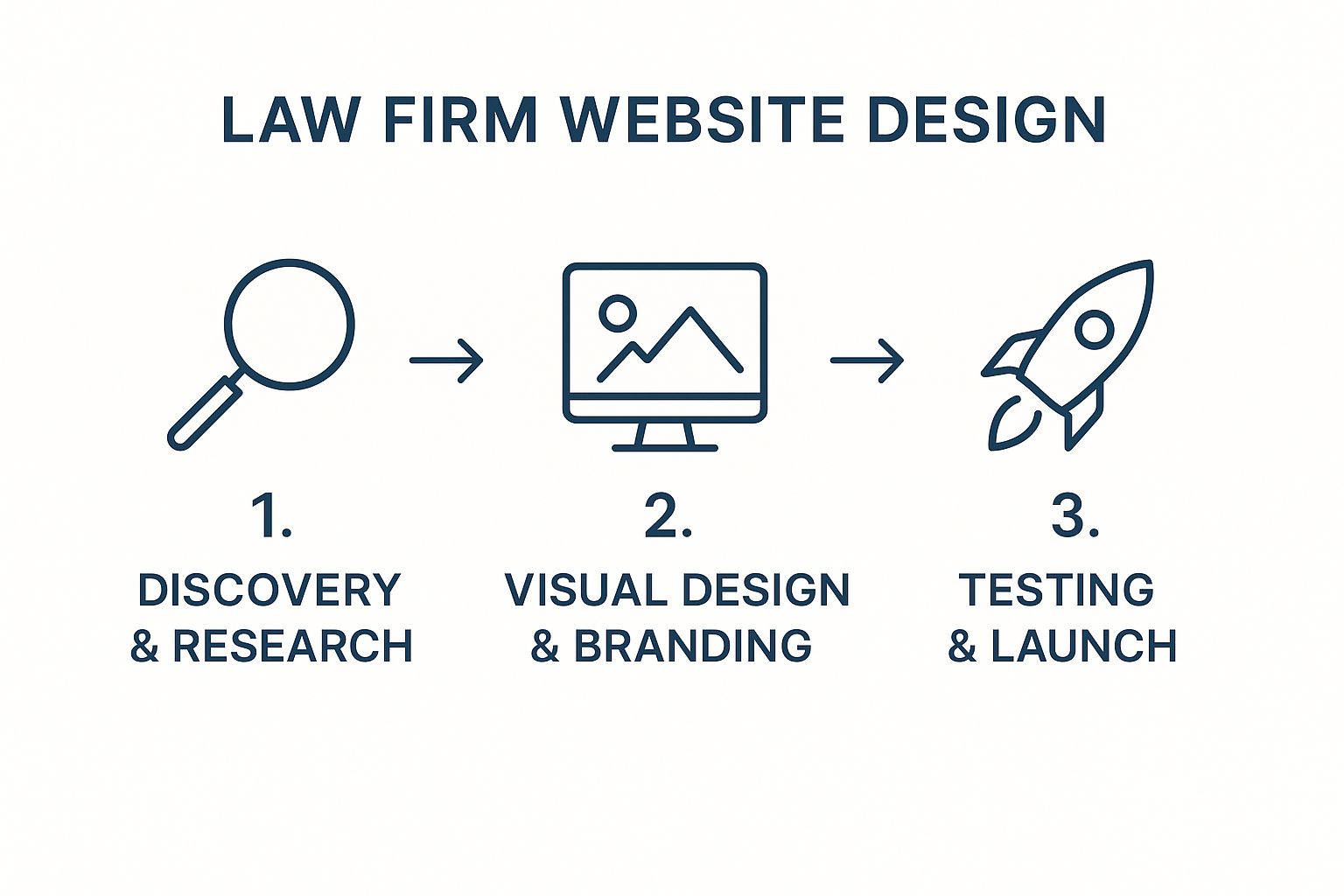
Building Your Website’s Strategic Foundation
Before you even think about colours, fonts, or layouts, you need to lay the groundwork. The most successful law firm websites are always built on a solid strategic foundation. Skipping this planning phase is like trying to build a house without a blueprint—it might look fine at first, but you’re guaranteed to run into structural problems down the track.
A thoughtful strategy ensures your website isn’t just an online brochure. It becomes a powerful client-acquisition engine, finely tuned to your specific practice areas. This is where you move past aesthetics and get serious about the business objectives your website needs to hit. Every design choice, every piece of content, and every feature should flow directly from this initial strategic work.
Define Your Ideal Client and Their Journey
First things first: you need to get incredibly specific about who you’re trying to attract. This means creating an ideal client persona. We’re not just talking about basic demographics here. You need to get inside their head, understand their legal pain points, and know the exact questions they’re typing into Google when they need a lawyer.
For instance, a family law firm might be targeting “Anna,” a 38-year-old professional who’s discreetly researching divorce options on her lunch break. She’s stressed, values clear communication, and is looking for a firm that comes across as both compassionate and authoritative. Her journey likely starts with a search like “best divorce lawyer Gold Coast,” and she’ll be scanning every website she clicks for signs of expertise and reassurance.
A website designed for “Anna” will naturally lean towards calming colours, simple navigation to family law services, and prominent client testimonials that directly address her concerns. This is a world away from a site built for a corporate client who needs commercial litigation services and cares more about efficiency and big case results than anything else.
Mapping this process out—what’s known as the client journey—allows you to anticipate what your user needs and guide them from a state of uncertainty to taking a confident next step, like booking that initial consultation.
Craft a Compelling Value Proposition
Once you have a sharp picture of your ideal client, you can tell them exactly why they should choose you. Your value proposition is a clear, punchy statement that communicates your unique benefit. It’s the simple answer to the question every potential client is asking: “Why should I hire your firm over all the others?”
A weak value proposition is generic and forgettable, like “We offer expert legal services.” A strong one is specific and focused on the client’s needs:
- For a personal injury firm: “We handle every part of your claim so you can focus on recovery. You don’t pay unless we win.”
- For a business law firm: “We provide fixed-fee legal advice for startups, giving you budget certainty while you grow.”
This core message needs to be front and centre on your homepage. It should shape your main headline, your introductory text, and the calls-to-action you use throughout the site.
Before we get into the nitty-gritty of design, it’s crucial to solidify these foundational elements. The table below summarises the core components of your website blueprint, helping you define your strategy before a single design decision is made.
Core Components for Your Website Blueprint
| Strategic Component | Key Questions to Answer | Impact on Website Design |
|---|---|---|
| Ideal Client Persona | Who are they? What are their pain points, goals, and online habits? | Influences visual tone, messaging, and content priorities. |
| Client Journey Map | What steps do they take from initial search to contacting you? | Dictates site structure, navigation, and call-to-action placement. |
| Value Proposition | What makes your firm the best choice for this specific client? | Shapes the homepage headline and all key marketing copy. |
| Business Goals | What specific, measurable outcomes do you want the website to achieve? | Determines which features are essential (e.g., booking forms, lead magnets). |
Defining these elements upfront ensures every part of your website serves a purpose, guiding potential clients toward the exact action you want them to take. It’s the difference between a website that just exists and one that actively works for your firm.
As you can see, this foundational research is the first and most critical phase. It directly informs and shapes all the design and development stages that follow.
Establish and Measure Business Goals
Finally, your strategy needs goals you can actually measure. Vague objectives like “get more clients” simply won’t cut it.
You need to set specific, measurable, achievable, relevant, and time-bound (SMART) goals. For example:
- Generate 20 qualified leads per month through the contact form.
- Increase online consultation bookings by 30% in the next quarter.
- Achieve a top-3 ranking for the keyword “criminal lawyer Broadbeach” within six months.
These goals will dictate your website’s essential features and, most importantly, help you measure your return on investment (ROI). After all, the data shows that over 70% of prospective clients start their search for a law firm online. In fact, our own analysis of Australian legal websites reveals that leading firms have boosted client inquiries by 40% to 60% after redesigns that were laser-focused on these very strategic elements.
Designing for Client Trust and Confidence
When someone lands on your law firm’s website, you have a split second to make an impression. In the legal world, this isn’t just about looking sharp; it’s about instantly communicating trust, authority, and empathy. Your potential clients are often arriving under stress, and a great website guides them from a place of anxiety to a feeling of confidence that you can help.
This all starts with the visual language of your site. Every single design choice, from the colour palette to the font, sends a subconscious message. The goal here isn’t to chase fleeting design trends. It’s about making deliberate choices that build a digital space that feels secure, clear, and professional – one that connects with your ideal client on an emotional level.
Crafting a Reassuring Visual Tone
The colours and typography you pick are the foundation of building that initial trust. They’re the first thing a visitor processes, long before they’ve read a single word of your carefully written copy.
A well-considered colour palette for a law firm often leans on:
- Deep Blues and Greys: There’s a reason these colours are staples. They convey professionalism, stability, and seriousness—all crucial qualities people look for in legal representation.
- Earthy Greens or Browns: These can add a sense of calm and approachability. This works particularly well for practices like family or estate law, where a softer, more human touch is needed.
- A Single, Strong Accent Colour: A touch of gold, deep maroon, or a vibrant (but not jarring) secondary colour is perfect for calls-to-action and important highlights. It helps guide the eye without creating visual clutter.
Typography speaks volumes, too. Your font choice needs to scream readability and authority. A classic serif font like Garamond or Lora for headings can suggest tradition and experience, while a clean sans-serif font like Lato or Open Sans for body text ensures everything is crystal clear and easy to read on any screen. Just steer clear of overly decorative or thin fonts that are tough to read and can come across as unprofessional.
The core idea is simple: Your visual design should make a potential client feel like they are in capable hands. It needs to look like a digital extension of a well-run, professional law practice, not an experimental art project.
Prioritising an Intuitive User Experience
Visuals are important, but the real heavy lifting in building trust comes from the user experience (UX). If your website is confusing or frustrating to use, any confidence a visitor had will evaporate instantly. The goal is to create a seamless, intuitive journey that lets people find what they need with zero friction.
This is all about logical information architecture. Think of it as the blueprint for your site’s content. A potential client searching for a “personal injury lawyer” should be able to find your ‘Personal Injury’ practice area page right from the main navigation, in one click. From there, it needs to be obvious how to learn about specific claim types, see relevant case studies, and find your contact details.
This screenshot of top-performing Australian law firm websites shows how clean layouts and clear navigation create a powerful first impression.

Notice the consistent use of professional headshots, uncluttered menus, and prominent calls-to-action. These firms get it. A trustworthy website design prioritises clarity over complexity, making it easy for visitors to take the next step.
Structuring Content for Clarity and Conversion
The final piece of the trust puzzle is how you structure your pages. Long, intimidating blocks of text are a surefire way to send users running for the ‘back’ button. Your content absolutely has to be scannable and easy to digest.
Here are a few practical tips for structuring your content:
- Use Short Paragraphs: Keep every paragraph to just two or three sentences, max. This creates valuable white space and makes the content feel much more approachable.
- Employ Clear Headings: Use descriptive subheadings (like the ones in this article) to break up long pages and guide readers through the information.
- Strategically Place CTAs: Every single page should have a clear call-to-action (CTA). Whether it’s “Book a Free Consultation” or “Download Our Guide,” you need to tell the user what to do next. Don’t make them hunt for your contact form.
- Incorporate Social Proof: Client testimonials, case results, and industry awards should be displayed prominently. This is one of the most powerful ways to build credibility and give potential clients confidence in your firm’s abilities.
By combining a reassuring visual tone with a frictionless user experience, your website becomes a powerful tool. It does more than just present information; it actively builds the trust and confidence needed to turn a worried visitor into a new client.
The Essential Features of a High-Performing Law Firm Website
A great law firm website is much more than a digital business card—it’s a dynamic tool that should be actively generating business. Beyond a slick homepage, your site needs specific, well-thought-out pages and features that guide visitors, build trust, and ultimately, get them to pick up the phone.
These aren’t just optional add-ons; they’re the core components that transform a passive website into a client-generating machine. From demonstrating your deep knowledge on practice area pages to making a human connection with compelling lawyer bios, every piece has a job to do. Without them, your website is just a signpost. With them, it becomes your hardest-working employee.

Detailed Practice Area Pages
Let’s be blunt: your practice area pages are the most important commercial pages on your entire website. When a potential client searches for “commercial litigation lawyers in Sydney,” they don’t want to land on your homepage and have to hunt around. They need a page that speaks directly to their problem and proves you have the specific experience to solve it.
These pages need to be more than just a quick paragraph. A high-performing practice area page should include:
- A Clear Overview: Explain what the practice area covers in plain English. Ditch the dense legal jargon that will only confuse and alienate your ideal client.
- Specific Services: Break down exactly what you do. For family law, this might include divorce, child custody arrangements, and prenuptial agreements. Get granular.
- Relevant Case Studies: Showcase anonymised success stories. There is no better way to build confidence than by demonstrating past results.
- A Targeted Call-to-Action (CTA): End the page with a clear, direct next step. Something like “Contact Our Family Law Team for a Confidential Discussion” works perfectly.
Think of each practice area page as a specialised landing page. It’s your prime opportunity to show off your expertise and rank for those incredibly valuable, high-intent search terms.
Lawyer Bios That Build Connection
At the end of the day, clients hire people, not faceless firms. Your lawyer biographies are a critical chance to build that human connection. A dry CV listing credentials and university degrees is a massive missed opportunity. Yes, qualifications are important, but they don’t build trust on their own.
A compelling lawyer bio weaves professional achievements together with a touch of personality. Tell their story. Why did they choose this specific area of law? What are they truly passionate about? And of course, a professional, high-quality headshot is completely non-negotiable. It makes your firm more approachable and trustworthy.
A great bio transforms a lawyer from a simple service provider into a trusted advisor. It should give a potential client the feeling that they already know and can trust the person who will be handling their sensitive legal matter.
This is where you show the human side of your practice, and in a competitive market, that can be your biggest advantage.
A Blog or Resource Hub for Thought Leadership
A regularly updated blog or resource centre is an absolute powerhouse for modern law firm website design. It pulls double duty, hitting two critical business goals at once. First, it cements your firm’s reputation as a thought leader. Second, it’s a magnet for organic search traffic.
By consistently publishing genuinely helpful articles, guides, and legal updates that answer your ideal clients’ questions, you build incredible credibility. For instance, a property law firm could publish articles like “Common Pitfalls When Buying Off-the-Plan in Queensland” or “Understanding the New Strata Bylaws.” This content catches people in the early research phase, introducing them to your firm long before they’re ready to hire anyone.
This strategy positions you as a helpful expert, not just a sales pitch. It’s a long-term play that builds brand equity and creates a steady, reliable stream of qualified leads. If you’re looking for more ways to enhance your site’s structure, exploring different aspects of website design and optimisation can provide valuable insights into creating an effective digital presence.
The Non-Negotiable Support Features
Beyond the main content pages, a few supporting features are absolutely essential. These are the nuts and bolts that create a seamless and professional user experience, tying everything together.
| Feature | Primary Function | Why It’s Critical for Law Firms |
|---|---|---|
| Prominent Contact Details | Provide easy access for communication. | A client in distress needs your phone number or address instantly, without having to dig for it. |
| Persuasive Testimonials | Offer social proof and build credibility. | Hearing from past clients provides powerful, third-party validation of your skills and service. |
| Secure Intake Forms | Streamline the lead capture process. | An easy-to-use form lets clients get in touch 24/7, even well outside of business hours. |
These features are the final pieces of the puzzle. Making your phone number impossible to miss, showcasing glowing client reviews, and providing a secure, simple way to get in touch are what ultimately convert a curious visitor into a confirmed client. They remove friction and build the final layers of trust needed to prompt someone to take action.
Your Website Must Work for Mobile Users and Search Engines
Having a brilliant law firm website that looks stunning on a desktop monitor is a great start, but it’s only half the job. If your site isn’t built to perform on a smartphone and show up in search results, it’s practically invisible to most of your potential clients.
This isn’t just a “nice to have” feature; it’s a fundamental pillar of a modern law firm’s online presence.
Think about your ideal client for a moment. When they face an urgent legal issue, are they rushing to their office computer? It’s highly unlikely. They’re pulling out their phone, often in a moment of stress, and typing their problem straight into Google. Your digital front door has to be open, accessible, and easy to walk through on that small screen.
Failing to optimise for mobile and search is like having a beautiful, expensive office with a locked front door and no business listing. It doesn’t matter how skilled you are if nobody can find you or get inside.
Adopting a Mobile-First Mindset
The shift to mobile isn’t just a trend; it’s the established reality of how people find information, especially here in Australia. A mobile-first design philosophy means you design for the smallest screen first and then scale the design up for larger devices. This forces you to prioritise what’s truly essential, delivering a clean, fast, and frictionless experience for mobile users.
This is a world away from just making a desktop site “mobile-friendly,” which usually just means shrinking everything down. A genuine mobile-first approach results in a better, more focused experience on every device.
Mobile-first design has become a centrepiece of how law firm websites are developed in Australia, driven by the country’s massive mobile internet usage. As of 2024, over 85% of Australians accessed the internet on their smartphones, making mobile optimisation non-negotiable. We’ve seen firms that implement mobile-first strategies reduce their bounce rates by an average of 25% and increase session durations by around 15%. You can explore more on these emerging legal marketing trends and their impact.
A clunky mobile site is a huge red flag for potential clients. It subconsciously screams a lack of attention to detail—not a quality anyone wants in their legal team. A fast, intuitive mobile experience, on the other hand, builds instant confidence.
If you have a feeling your current site isn’t up to scratch on mobile, it’s vital to get it sorted. This guide on fixing a website that isn’t mobile-friendly is a good place to start.
A Primer on Law Firm SEO
Search Engine Optimisation (SEO) is the process of making your website more visible to search engines like Google when people make relevant queries. For a law firm, this means showing up when a potential client searches for “family lawyer near me” or “commercial lease review Gold Coast.”
Good law firm SEO isn’t just one thing; it’s several key components working in concert:
- Keyword Research: This is about identifying the specific words and phrases your ideal clients are actually typing into Google. Tools like Ahrefs or SEMrush can uncover what people are searching for, helping you zero in on keywords that signal real commercial intent.
- On-Page SEO: This involves optimising the individual pages of your website. It includes writing descriptive title tags and meta descriptions, using your target keywords naturally within the content, and ensuring your practice area pages are comprehensive and authoritative.
- Local SEO: This is absolutely critical for any firm serving a specific geographic area. It involves claiming and optimising your Google Business Profile, making sure your firm’s name, address, and phone number (NAP) are consistent everywhere online, and actively gathering positive client reviews.
Practical SEO Strategies You Can Use Today
Getting started with SEO doesn’t have to feel like an impossible task. If you begin with the basics and build from there, you can send clear signals to Google that your firm is a relevant, authoritative answer to a searcher’s legal problem.
Here are a few actionable steps to get the ball rolling:
- Optimise Your Homepage Title: Your homepage title tag is one of the most powerful SEO elements on your entire site. It needs to clearly state what you do and where you do it. For example: “Expert Family & Divorce Lawyers | Smith Legal | Brisbane“.
- Build Out Local Landing Pages: If you have offices in multiple locations, create a dedicated page for each one. A specific page for your “Broadbeach” office and another for your “Southport” office allows you to target location-specific searches far more effectively.
- Focus on High-Quality Content: Write content that genuinely helps your target audience. A blog post answering a common legal question not only builds trust but also gives Google more context about your expertise, helping you rank for a much wider range of search terms.
By weaving these mobile and search optimisation strategies into your website plan, you transform it from a static online brochure into a dynamic, powerful tool for bringing new clients through the door.
Launching and Maintaining Your New Website

It’s a great feeling to finally hit ‘publish’ on your new website. But it’s a mistake to see this as the finish line. In reality, it’s the start of the real work. A smooth launch and a solid maintenance plan are what turn a great-looking site into a genuine asset for your firm.
Ignoring what comes next is like buying a high-performance car and then never changing the oil. Eventually, performance will suffer. Before your site goes live, a thorough pre-launch check is absolutely non-negotiable. This is your chance to stress-test every single element to make sure the experience is flawless for your first visitors—who could easily be your next big client.
Your Essential Pre-Launch Checklist
Think of this as your final quality control before the big reveal. Spending a few hours on these checks can save you from the embarrassment and lost business that come with a buggy launch. You need to be methodical.
Here’s what a solid checklist looks like:
- Link and Form Testing: Click every single link on the site, from the main navigation right down to the footer. Fill out every contact form to confirm the submissions actually land in your inbox.
- Cross-Device Verification: You have to look at the site on different devices. Check it on an iPhone, an Android phone, a tablet, and a few different desktop browsers. Does it look right everywhere? Is the menu easy to use on a small screen?
- Proofreading and Content Review: Give everything one final read-through. Better yet, get a fresh pair of eyes on it. It’s amazing what typos and awkward sentences you can miss when you’ve been staring at the same text for weeks.
- Page Speed Check: Run your site through a tool like Google’s PageSpeed Insights. Slow websites are a killer for engagement. You need your pages loading in under 2 seconds to keep people from bouncing away.
A potential client’s first visit to your site is your one chance to make a great first impression. A broken link or a contact form that doesn’t work doesn’t just look unprofessional; it actively damages the trust you’ve worked so hard to build.
The Critical Role of Ongoing Maintenance
Once your website is live, it needs consistent care to stay secure, effective, and relevant. Technology moves fast, new security threats pop up, and what users expect from a website changes over time. A proactive maintenance plan is your best defence against becoming obsolete and vulnerable.
Good maintenance isn’t just about fixing things when they break—it’s about preventing them from breaking in the first place. For example, regularly updating your website’s software (like its CMS and plugins) is one of the most critical things you can do to shield it from security holes and keep it running smoothly. Protecting sensitive client data is non-negotiable, and outdated software is a welcome mat for hackers.
This proactive approach is so important. You can learn more about why website maintenance is key to a successful website and how it protects your digital investment for the long haul.
Monitoring Performance and Making Improvements
A website should never be a “set and forget” project. The data it produces is a goldmine, telling you exactly how real people are interacting with your firm online. Tools like Google Analytics are essential for tracking what’s working and, just as importantly, what isn’t.
Don’t get lost in vanity metrics. Focus on the numbers that actually tell a story:
- Bounce Rate: What percentage of visitors leave after looking at only one page? A high bounce rate could mean your content isn’t matching what they were searching for.
- Session Duration: How long are people sticking around? Longer sessions, especially on practice area pages or blog posts, are a great sign that your content is hitting the mark.
- Conversion Rate: This is the big one. Of all your visitors, what percentage actually fills out a contact form? This is the ultimate measure of your website’s performance.
By analysing this data, you can make smart, informed decisions to constantly improve the site. Maybe you’ll discover a call-to-action needs to be more prominent, or that a particular practice area page is crying out for more detailed information. This cycle of launching, monitoring, and refining is what keeps your website working as a powerful engine for your firm’s growth.
Answering Your Law Firm Website Design Questions
Embarking on a new website project always brings up plenty of questions. We get it. Below, I’ve put together some straight-to-the-point answers to the most common queries we hear from law firms. The goal here is to give you a bit more clarity and confidence as you think about your new site.
How Much Should a Law Firm Website Cost?
This is always the first question, and the honest answer is: it varies. A lot. You could get a simple, template-based site off the ground for a few thousand dollars, but a completely custom-built website with advanced features can easily run into the tens of thousands.
The final price really depends on the scope, complexity, and how much custom work is involved.
Think of it like buying a car. A basic model will get you from A to B, no problem. But a luxury vehicle delivers a completely different experience in performance, comfort, and features. The key is to anchor your budget to your business goals, not just a random figure. A great website isn’t an expense; it’s an investment in a powerful client-acquisition asset.
A cheap website that fails to bring in a single lead is far more expensive in the long run than a well-planned site that delivers a consistent, positive return on your investment.
How Long Does It Take to Build a New Website?
The timeline for a new law firm website also has a bit of a range, but you can generally expect it to take between 8 and 16 weeks. This process usually breaks down into a few key phases:
- Strategy and Planning: 1-3 weeks
- Design and Mockups: 2-4 weeks
- Development and Content Integration: 4-7 weeks
- Testing and Launch: 1-2 weeks
Honestly, the biggest factor that can stretch out a timeline is you, the client. Getting feedback to us in a timely manner and providing content (like lawyer bios or practice area descriptions) on schedule is what keeps the project humming along. Delays in those two areas are the most common reason a project goes past its initial estimate.
What’s More Important: Design or Content?
Ah, the classic “chicken or egg” dilemma. But in this case, the answer isn’t one or the other. They are equally vital and absolutely must work together.
A stunning design with weak, unhelpful content is useless—it won’t build trust with visitors or get you found on Google. On the flip side, even the most brilliant, persuasive content will be lost on a clunky, poorly designed website that just frustrates users and sends them clicking away.
A high-performing site is a perfect marriage of compelling, client-focused content and an intuitive, professional design. One simply cannot succeed without the other. This synergy is what turns a casual browser into a confident potential client.
Can I Just Use a Website Template?
You certainly can. For a new solo practice or a firm on a really tight budget, using a template from a platform like WordPress can be a decent starting point. There are countless professional-looking options out there.
However, a template will always come with limitations. You’ll hit a wall when it comes to customisation, and it’s unlikely to be structured in a way that’s optimised to convert legal clients specifically.
A custom design, on the other hand, allows you to build a website that’s tailored precisely to your ideal client’s journey and your firm’s business goals. If your budget can stretch to a custom build, it almost always delivers better long-term results. It’s what helps you stand out from the competition and ensures every single element is designed to drive enquiries. To learn more about improving your site’s effectiveness, check out our guide on boosting website performance with CRO.
At Titan Blue, we have over two decades of experience creating high-performance websites for Australian law firms that build trust and generate leads. Book a free strategy session to discuss how we can build a digital asset that works as hard for your firm as you do.

The Best AI SEO Tools for Australian Businesses in 2026: Compared and Ranked
The best AI SEO tools for Australian businesses in 2026 cover two distinct needs: AI-powered…
Traditional SEO vs AI SEO: What Australian Businesses Need in 2026
Traditional SEO and AI SEO are two distinct but complementary approaches to online visibility. Here's…

10 AI SEO Myths Debunked: What Australian Businesses Actually Need to Know
10 of the most damaging AI SEO myths costing Australian businesses visibility in ChatGPT, Google…