Stay ahead with the latest tips, trends, and insights from the Titan Blue team , straight from the studio in Broadbeach.
Making your website NDIS-accessible isn't just a box-ticking exercise in technical compliance. It’s a genuine business strategy that opens up your services to a huge part of the Australian market. By building an inclusive website, you're welcoming one in four Australians living with a disability, turning social responsibility into a real commercial win.
Why Accessibility Is a Non-Negotiable Business Strategy
For any Aussie small or medium-sized business—whether you're running a local restaurant, a construction firm, or a plumbing service—your website is your digital front door. An inaccessible site is basically a locked door for a quarter of your potential customers. Forget the tech jargon for a moment; NDIS accessible website design is really about customer service and sustainable growth.

This isn't about dodging legal headaches. It’s about making a conscious choice to serve everyone in your community. When people with disabilities can easily find information, book a service, or navigate your site, they feel seen and respected. That positive experience builds powerful brand loyalty and trust that money can't buy.
Expanding Your Customer Base
The commercial logic here is pretty straightforward. The disability community in Australia holds significant spending power. If you ignore their online needs, you’re willingly leaving revenue on the table for your competitors. An accessible website instantly broadens your audience, giving you an edge over businesses that haven’t caught on yet.
Think about these benefits:
- Increased Market Reach: You become the go-to provider for a large and loyal customer base that is often completely overlooked.
- Enhanced Brand Reputation: Showing a real commitment to inclusivity resonates with modern consumers, even those without disabilities who prefer to support socially responsible businesses.
- Improved User Experience for All: Here's the kicker—many accessibility features like clear navigation, readable fonts, and captioned videos make the website experience better for every single visitor, not just those with disabilities.
Building Lasting Brand Trust
In today's market, people connect with brands that align with their values. Investing in an accessible website is a clear, public statement that your company is committed to equality. This kind of corporate citizenship builds a level of trust that traditional advertising just can't compete with.
This guide will walk you through the practical steps of getting it done, but it all starts with this shift in mindset. It’s not a cost; it’s an investment in a bigger, more loyal customer base and a stronger, more respected brand. As you get started, you can explore the broader principles in our guide to accessible website design, which sets a great foundation for what’s ahead. This approach ensures your business is not just compliant, but competitive and compassionate.
Understanding Your Legal Obligations in Australia
Navigating the legal side of web accessibility in Australia can feel a bit tangled, but it really comes down to one core idea: providing equal access for everyone. The main piece of legislation you need to know about is the Disability Discrimination Act 1992 (DDA). This Act makes it illegal to discriminate against someone because of their disability, and yes, that absolutely includes the digital world.
An inaccessible website can be legally viewed as denying goods, services, or facilities to people with disabilities. This isn't just a theoretical risk; it has real teeth. Failing to comply can lead to serious legal challenges and hefty financial penalties, making it a critical focus for any Australian business with an online presence.
So, how do you know if you're compliant? That’s where the technical standards come in. While the DDA doesn't spell out specific coding requirements, Australian courts and government bodies consistently point to the Web Content Accessibility Guidelines (WCAG) as the definitive benchmark.
The Gold Standard: WCAG 2.2 Level AA
What exactly is WCAG? Think of it as the global instruction manual for building websites that everyone can use. It’s broken down into three levels of conformance: A (the basics), AA (the accepted industry standard), and AAA (the highest, most stringent level).
For Australian businesses, WCAG 2.2 Level AA is the recognised standard. The government's own National Transition Strategy cements this, setting a clear expectation for all public-facing digital services. Getting your site to this level is the single most effective way to meet your obligations under the DDA.
Let's make this real for a small business owner.
- For a local cafe: This means your online menu has to be readable by a screen reader, and your booking form must work perfectly using just a keyboard.
- For a plumbing service: This means any videos showing your work need to have captions, and the colour contrast on your "Request a Quote" button must be strong enough for someone with low vision to see it clearly.
At its heart, WCAG 2.2 Level AA ensures the core functions of your website are usable by everyone. It’s not about achieving absolute perfection; it's about providing a solid, fair, and equitable experience for all your visitors. It's smart to see these legal requirements not as a burden, but as a protective framework. Being compliant safeguards your business while opening your doors to a much wider audience.
The Growing Reality of Non-Compliance
Ignoring these obligations is becoming an increasingly bad bet. Across Australia, we're seeing a surge in web accessibility lawsuits filed under the Disability Discrimination Act 1992 (DDA). This trend is forcing businesses of all sizes—from restaurants and plumbers to solar firms—to take WCAG 2.2 Level AA seriously. It's no longer just a recommendation; it's a legal necessity.
This isn't an issue reserved for big corporations or government departments. Small and medium-sized businesses are just as accountable. Legal precedent is clear: if your website creates a barrier for someone with a disability, you could be held liable.
For many business owners, this raises some pretty important questions about their own websites. If you're a registered NDIS provider, the expectations are even higher, as accessibility is a founding principle of the entire scheme. If this sounds like you, you might find our dedicated guide to web design for NDIS providers helpful, as it dives much deeper into these specific requirements.
Ultimately, getting a firm grip on your legal duties is the first, most important step toward building a better, more inclusive website. It aligns your business with Australian law, protects you from potential disputes, and shows your community that you're a responsible and welcoming brand.
Designing for Real-World Human Experience
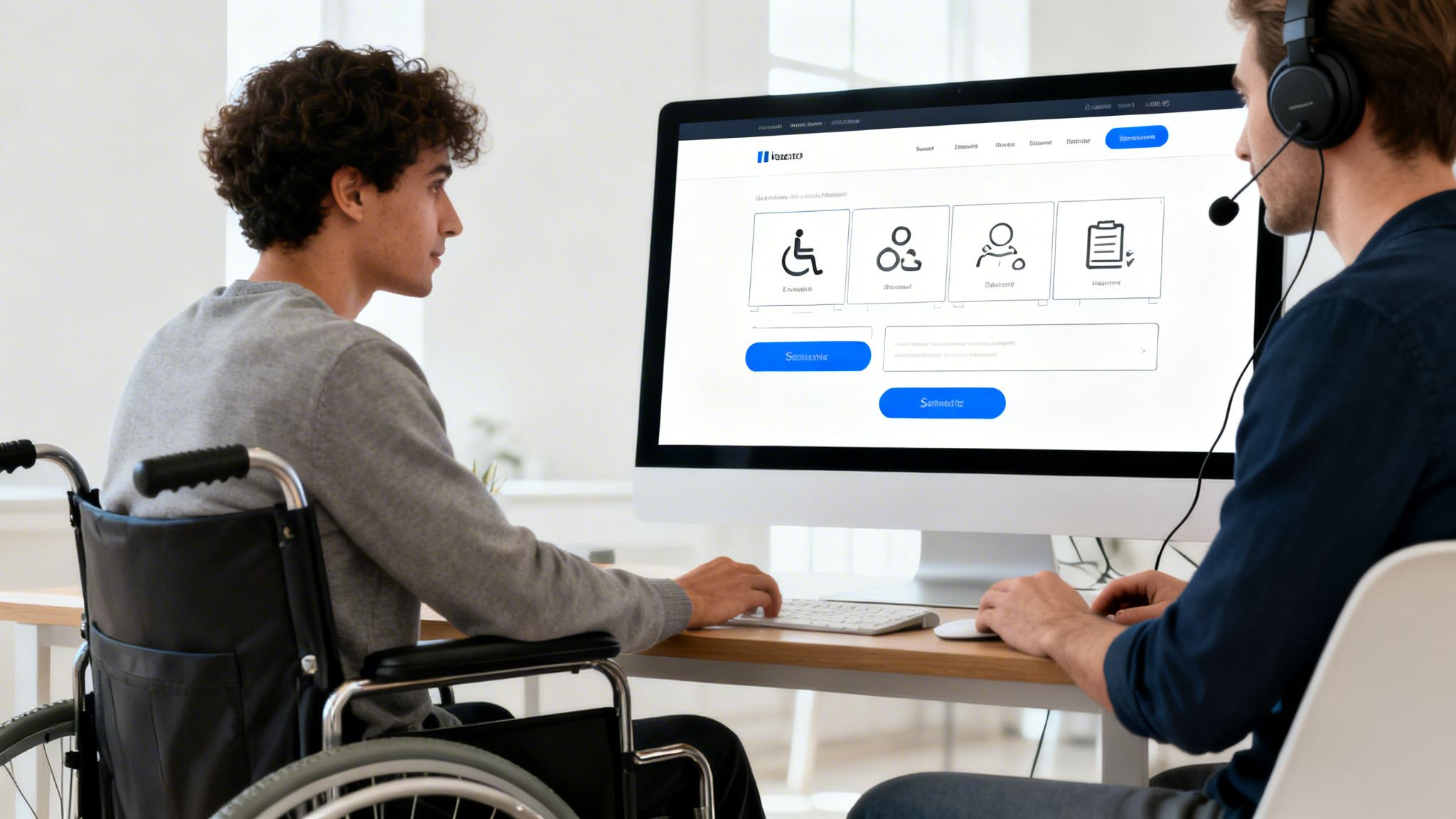
Let's move beyond the legal jargon and into the real world. At its heart, NDIS accessible website design is all about people. It's not a matter of ticking boxes on a compliance sheet; it's about crafting an online experience that genuinely works for everyone, no matter how they see, hear, or interact with the web.
This user-first approach means you have to put yourself in the shoes of individuals with diverse abilities. Think about the person who uses a keyboard instead of a mouse, relies on a screen reader to digest your content, or needs high colour contrast to simply read your service descriptions.
Unfortunately, many organisations still miss the mark. A 2020 study of 127 NDIS-related websites found pretty mediocre accessibility scores, creating serious roadblocks for people trying to find vital information. It’s a classic case of good intentions not translating to real-world usability.
Building Intuitive Navigation
Clear, logical navigation is the absolute backbone of an accessible website. If visitors can't find what they’re looking for straight away, all your other design efforts are for nothing.
Think beyond the typical mouse-clicker. Someone with a motor disability might be navigating your site entirely with their keyboard, using the 'Tab' key to jump from one link to the next. This means your website absolutely must have a visible focus indicator—that glowing border you see around a selected button—so they always know exactly where they are on the page.
Beyond that, a well-structured menu and a logical page hierarchy are non-negotiable. Use descriptive, straightforward labels for your links. Instead of a vague term like "What We Do," try something like "Our Disability Support Services." This tiny change provides instant clarity and helps everyone, especially screen reader users, understand where a link will take them before they click.
Contrast and Colour Choices
Your visual design choices have a massive impact on accessibility, especially for users with low vision or colour blindness. Picking a high-contrast colour palette is one of the single most effective things you can do.
WCAG 2.2 Level AA guidelines require a contrast ratio of at least 4.5:1 for standard text and 3:1 for large text. Don't leave this to guesswork. Use free online contrast checkers to test all your colour pairings, including:
- Text on background colours
- Button text on button colours
- Icons and other important graphics
And remember, never rely on colour alone to convey information. If you've got an error message on a form, don't just make the field border red. Pair it with an icon and clear, written text that explains the problem. This ensures the message gets across to everyone. When starting out, many businesses look into general WordPress website design services to build their site, and any good developer should have these fundamentals down pat.
Creating Accessible Forms
Forms are often the main way potential clients get in touch, making them a critical touchpoint. An inaccessible form is like locking your front door – it's a direct barrier to new business.
Every single field in your form needs a clear, properly associated <label>. This is what allows a screen reader to announce what each input box is for. Placeholder text is not a substitute, as it vanishes the moment someone starts typing and is often skipped by assistive tech.
Error handling is just as important. When a user makes a mistake:
- Clearly flag which fields have errors.
- Provide helpful, text-based instructions on how to fix them.
- Automatically bring the user's focus to the first error so they can get right to it.
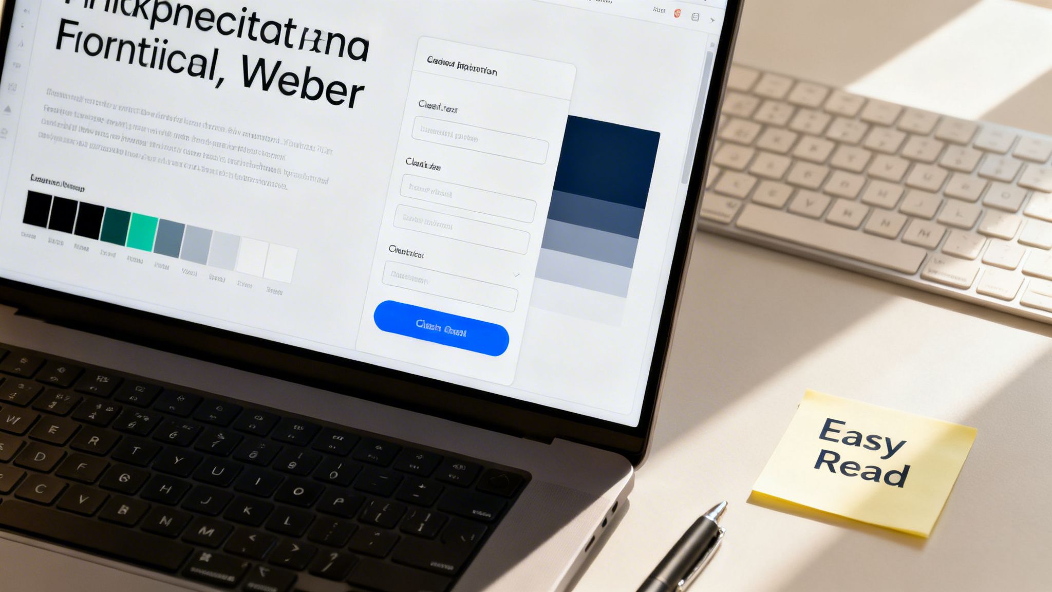
Crafting Easy Read Content
For many people, including those with cognitive disabilities, learning difficulties, or low literacy, a wall of standard web text can be completely overwhelming. This is where Easy Read content becomes an absolute game-changer. Easy Read isn't about "dumbing down" your text. It's a strategic way of presenting information using simple language, short sentences, and supportive images to make complex topics understandable.
As an NDIS provider, this means explaining your services, pricing, and sign-up process in a way that’s crystal clear. Break down that confusing NDIS jargon, use dot points to list benefits, and pair key ideas with relevant photos or icons. This simple approach empowers participants and their families, giving them the confidence and autonomy to make informed decisions.
By weaving these practical design patterns into your site, you’ll shift from having a merely compliant website to one that is genuinely usable. The next step is taking this thoughtful design and turning it into clean, functional code. To see how these concepts are put into practice, you can read more about our approach to NDIS website development.
Accessible Development and Content Workflows
This is where your thoughtful, user-centric design becomes a functional reality. The development phase is the bridge between concept and a working website that assistive technologies can actually interpret and navigate. It’s all about building a solid, logical foundation with clean code.
This process goes way beyond just making a site look good; it demands a deep understanding of how code creates structure and meaning. By focusing on a few core development principles, you can build a site that’s robust, compliant, and genuinely usable for everyone.
Building with Semantic HTML
Think of semantic HTML as the architectural blueprint for your website. It uses specific HTML tags to give meaning and structure to your content. Instead of throwing generic <div> tags at everything, a developer will use tags like <nav> for navigation, <header> for the page header, <main> for the core content, and <button> for interactive buttons.
Why is this so important? For a screen reader, it’s everything. These tags create a clear, logical map of the page.
- A user can instantly jump to the
<nav>section to find the main menu. - They can skip past the
<header>directly to the<main>content. - The software announces a
<button>as a clickable element, telling the user they can interact with it.
Without this semantic structure, the page is just a confusing mess of text for assistive technologies. It's a foundational practice that costs nothing extra but makes a world of difference for accessibility.
Enhancing Interaction with ARIA
Sometimes, standard HTML doesn't quite have a tag for a more complex interactive element, like a custom pop-up modal or a collapsible accordion menu. This is where ARIA (Accessible Rich Internet Applications) comes into play. ARIA attributes are like little signposts you add to your HTML to provide extra context for assistive technologies.
For instance, a developer can use aria-expanded="false" on a collapsed menu to tell a screen reader it's currently closed but can be opened. When a user clicks it, the code flips it to aria-expanded="true", and the screen reader announces the change. This small addition makes dynamic website features usable for people who can't see the visual changes happening on screen.
Choosing the Right Content Management System
Your choice of Content Management System (CMS) plays a massive role in maintaining accessibility for the long haul. A good CMS should make it easy for your team to create and update content without needing to be accessibility experts themselves.
When you're evaluating a CMS like WordPress, look for features that support NDIS accessible website design right out of the box:
- Built-in Alt Text Fields: The system should prompt you to add alternative text for every single image you upload. It shouldn't be an afterthought.
- Heading Level Management: It needs to provide a simple, intuitive way to structure content with proper headings (H1, H2, H3) to maintain a logical hierarchy.
- Accessible Templates: The core themes and templates it offers should be built with accessibility best practices already baked in.
Picking a CMS that prioritises accessibility from the ground up stops your team from accidentally creating new barriers every time they publish a blog post or add a new service page. A well-chosen CMS empowers your entire team to be custodians of your website's accessibility. It integrates compliance into your daily operations, rather than making it a separate, technical task.
This integration is key. Even official bodies can struggle to maintain their own standards. The NDIS Review itself commits to W3C Web Accessibility Initiative standards, yet many government-related sites lag behind, often storing crucial information in inaccessible formats like PDFs that can exclude users.
Ultimately, a sustainable workflow is one where your technology and your processes work together. This means the technical build is solid, and your content creation process reinforces that foundation. Our insights on content writing for websites can provide further guidance on creating text that is both engaging and accessible from the start.
How to Test and Maintain Your Accessible Website
Getting your NDIS accessible website live is a massive milestone, but it's not the finish line. Think of it as day one. Technology evolves, content gets updated, and accessibility standards shift—so consistent testing and maintenance are non-negotiable to keep your site compliant, functional, and genuinely welcoming for everyone.
This isn’t about getting bogged down in endless, complex audits. It's about creating a simple, sustainable rhythm of checks and balances that protects your investment and keeps your digital front door wide open. The best way to do this? A multi-layered approach that mixes automated tools, manual checks, and, most importantly, real human feedback.
Adopting a Three-Pronged Testing Strategy
A solid testing plan never relies on just one method. Instead, it combines the sheer speed of automation with the critical thinking and nuance of a human eye. This approach helps you catch a much wider range of potential issues, giving you both quick fixes and deep, meaningful insights.
To really nail this, it helps to use specialised tools. If you want to see what's on the horizon, some great resources detail tools that check product UI for accessibility using AI, which gives a peek into the future of automated testing.
Here’s how to structure your testing process:
-
Automated Scanning: These are software tools or browser extensions that crawl your website and flag common WCAG problems in minutes. They're brilliant for catching the low-hanging fruit—things like missing alt text, poor colour contrast, or empty links. While they can't catch everything, automated scans are the perfect first pass to quickly find and fix widespread issues.
-
Manual Checks: This is where you or someone on your team steps into the shoes of users with disabilities. The single most important manual test is keyboard-only navigation. Seriously, just unplug your mouse and try to get around your entire website using only the Tab, Enter, and arrow keys. Can you reach every link? Fill out every form? Use every dropdown menu? This one test reveals an incredible amount about how operable your site actually is.
-
User Testing with People with Disabilities: This is, without a doubt, the gold standard. It's the most valuable part of any testing process. Automated tools find code errors, but only real users can tell you if your site is genuinely usable. Involving people who use screen readers, magnifiers, or other assistive tech every day provides authentic, invaluable feedback on their actual experience. Their insights will uncover roadblocks that no software or manual check ever could.
This diagram helps visualise how to embed accessibility right from the get-go, from the initial code structure all the way to empowering users through their feedback.
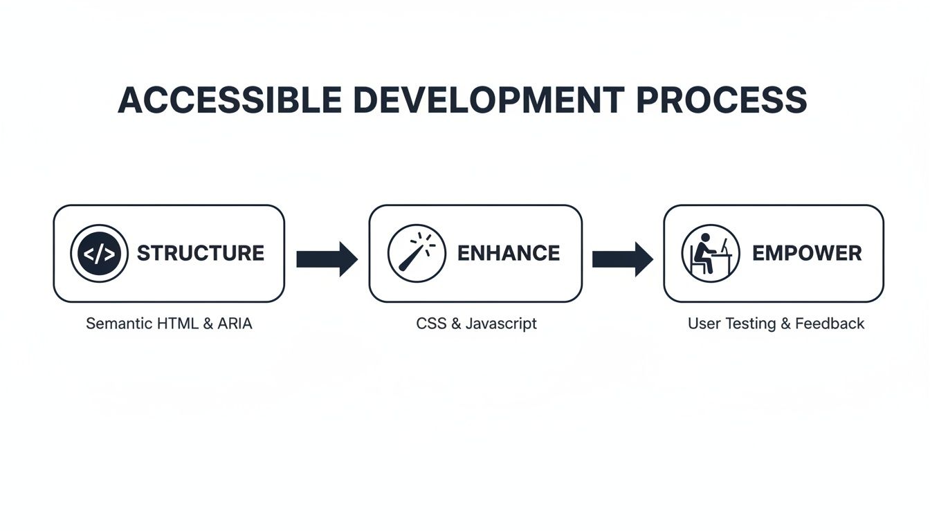
This process shows that building an accessible site starts with a solid code foundation, is improved with inclusive design choices, and is ultimately proven by the real-world experiences of the people using it.
Creating a Post-Launch Maintenance Checklist
Once your site is live, accessibility can slowly degrade as new content gets added and software gets updated. A simple maintenance routine is the best way to prevent this "accessibility drift".
Your checklist should include things like:
- Regular Content Audits: Every few months, take a look at new pages or blog posts. Check that all new images have descriptive alt text, videos have captions, and the heading structure still makes sense.
- Software and Plugin Updates: Always keep your CMS, theme, and any plugins up to date. Developers often release updates that include accessibility improvements or patch bugs that might be creating new barriers.
- Team Training Refreshers: If you have multiple people adding content, make sure they all know the basics of creating accessible content. A quick annual refresher can stop common mistakes from creeping back in.
For businesses that need to focus on their day-to-day operations, a professional website maintenance package can take care of all these technical checks. It ensures your site stays secure, updated, and accessible without adding another task to your plate.
Measuring What Truly Matters
Finally, tracking success is about more than just a pass/fail on a compliance report. You need to measure the real-world impact of your NDIS accessible website design.
Look at meaningful Key Performance Indicators (KPIs) that tell the true story:
- Reduced Bounce Rate from Assistive Tech Users: Your analytics can help identify users of assistive technologies. If the bounce rate for this group is dropping, it's a good sign they're finding your site more engaging and easier to use.
- Increased Form Submissions: Are more people successfully filling out your contact or enquiry forms? This is a strong indicator that you’ve removed frustrating usability barriers.
- Positive User Feedback: Don't be afraid to ask for feedback. A simple, accessible feedback form can provide priceless qualitative data that’s just as important as any number.
By testing thoughtfully and maintaining your site with discipline, you ensure it doesn't just meet a standard on launch day—it remains a valuable, inclusive, and effective asset for your business for years to come.
Your NDIS Website Accessibility Questions, Answered
When you're looking to build an NDIS-accessible website, a few practical questions always come up. Business owners naturally want to know about the costs, the legal side of things, and what actually works. Getting clear, straight answers is the first step to making a smart decision for your business.
The first thing on everyone's mind? The budget. There's a common myth that making a website accessible is a huge, expensive add-on.
How Much Will an Accessible Website Cost Me?
The real answer depends entirely on when you start thinking about accessibility.
If you bake it into the process from the very beginning of a new website build, it’s by far the most affordable way to do it. It just becomes a natural part of the design and development budget, not a separate line item.
On the other hand, trying to patch up an old, inaccessible website can turn into a massive and costly headache. It's always better to build the foundations right the first time than to go back and try to fix a cracked slab. Think of it less as a cost and more as an investment that opens your doors to more customers.
Is Following WCAG 2.2 AA Actually a Legal Thing?
This is a big one for any Australian business owner. While the Disability Discrimination Act (DDA) 1992 doesn't call out WCAG by name, you need to look at how the law has been interpreted in court.
Australian courts consistently point to WCAG 2.2 Level AA as the technical standard for whether a website is reasonably accessible. For all intents and purposes, if you meet that standard, you're doing what's needed to meet your legal duties under the DDA. It’s your best protection against discrimination claims.
What About Those Accessibility Plugins or Overlays?
You’ve probably seen the ads for plugins or "overlays" that promise to make your site compliant instantly with just one line of code. They’re sold as a quick, cheap fix, but they simply don't work as advertised. These automated tools can't fix the deep, structural code problems that cause accessibility issues. Worse, they often interfere with the assistive technology people are already using, making the website even more frustrating to navigate.
There are no shortcuts to creating a genuinely inclusive online experience. A truly accessible website is built with care, combining clean code, smart design, and feedback from real users. It’s the only way to build something that is genuinely usable and compliant for every single visitor.
Ultimately, building an NDIS-accessible website isn't just about compliance; it's a strategic choice. It shows you're committed to serving every person in your community, which builds a stronger brand and drives real growth.
At Titan Blue Australia, we build websites that don't just tick boxes—they connect you with your entire community. If you’re ready to build an inclusive online presence that gets results, we're here to help. Get in touch with us today.

How to Build Topical Authority for AI Search: The Complete 2026 Guide
Learn how to build topical authority that earns citations from ChatGPT, Google AI Overviews, and…

Zero-Click Search in the AI Era: What Australian Businesses Must Do to Stay Visible
Over 80% of searches now end without a click. Learn what zero-click search means for…

How to Track AI Search Traffic: The Complete GA4 Setup Guide for Australian Businesses
Learn how to track AI search traffic in Google Analytics 4 with custom channel groups,…