When someone looks for legal help, they’re already deciding who they can trust. That decision often starts online. A strong law firm website design does more than look tidy. It helps people feel confident before they’ve even made first contact. By the time October rolls around, it’s smart to check if your website still fits how your clients behave.
With summer just ahead, people spend more time on their phones, out and about, often searching on short notice. The right design keeps things simple, clear, and quick to use. And it helps make sure the right people find you at the right time. If your site feels too dated or too cold, it won’t take long before someone clicks away.
A good website design won’t try too hard. It just works—quietly, clearly, and without getting in the way. Creating a sense of clarity and trust is key here. So let’s look at what that actually takes.
First Impressions Matter: What People See First
The first thing people notice isn’t always what you meant to highlight. It might be your logo’s size, the colours used, or how crowded everything feels. Clean, calm design gives a sense of control. If your logo is clear and positioned with care, it speaks before anything else does. Pair that with neutral colours, modern fonts and no clutter, and you’ve already said more than a paragraph can.
Header design matters more than you might think. A header that lets someone know where they are, without needing to squint or think too hard, creates less stress for the user. We’re drawn to layouts that point us in the right direction without shouting. Top navigation should be short and sharp. No confusing dropdowns or terms people don’t use in everyday life.
The rest needs space to breathe. Big chunks of text or tiny images crammed together make the site feel hard to use. Clear gaps, crisp images and a few small animations (only if they load fast) help keep a visitor’s attention without tiring them out.
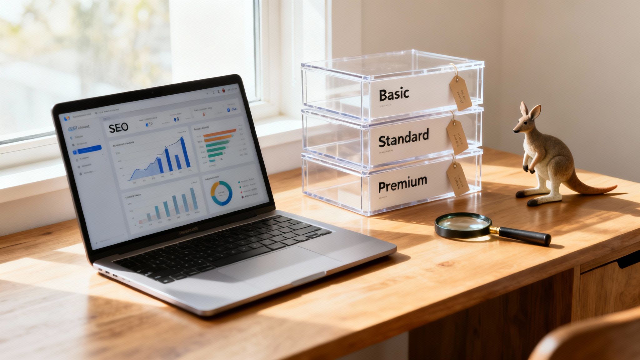
Titan Blue Australia delivers website designs for law firms that use clear branding, clutter-free layouts, and fast-loading headers, keeping the focus on trust and professionalism.
Making It Easy to Understand and Navigate
Your services might be technical, but your website doesn’t need to be. Avoid legal terms in your menus. Use phrases people expect. Think “Family Law” instead of “Domestic Relations” or “Help with Divorce” instead of “Separation Proceedings.”
When someone clicks through, each service page should explain what’s offered in plain language. People want to know what to expect, how it works, and what makes your firm a good choice. No long-winded paragraphs. Use short sentences and quick-to-read blocks of copy.
Navigation should feel like a straight path, not a maze. Each page should gently guide the reader forward, offering the next useful bit of info when they need it. Internal links matter here. They help people move without stopping to think, and that makes a big difference in whether they stay or leave.
Titan Blue Australia structures law firm websites with easy navigation and human-centred language for a smoother user journey.
Local Trust Elements That Make a Difference
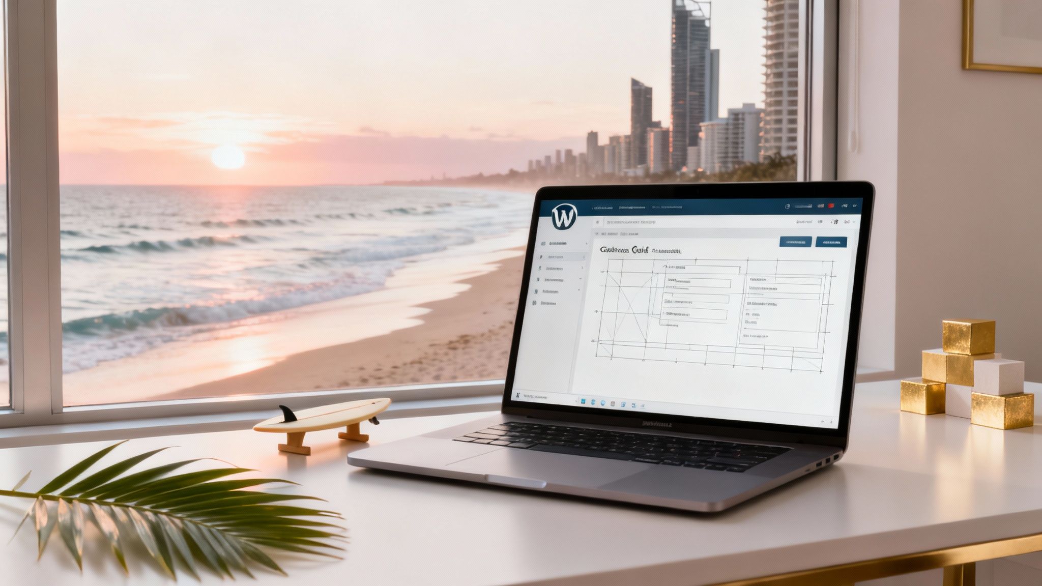
If your firm is based on the Gold Coast, don’t hide it. People feel more at ease when they see familiar places and names. That might mean using photos of your actual office, showing your team outside a recognisable spot like Kurrawa Beach, or even mentioning local events in a blog post or update.
Authentic photos—not stock images—can go a long way. Showing someone in a real workspace or at a community event signals honesty. It’s these small cues that help build early trust.
Mobile searchers particularly appreciate simple maps and clear contact details that auto-open on their phones. Use Google Business Profile properly, keep your pin accurate, and check that hours and directions are correct. If someone’s already nearby and checking your info while walking, every second they save means they’re more likely to walk in or call.
Building for Spring Site Behaviour
By mid-October, spring on the Gold Coast is in full swing. Days are warmer, and people are more mobile. That changes how and when they use your website. Most will be on their phones—quickly browsing before heading into a meeting or while out running errands.
This means your site has to load fast, scale correctly on all screens, and offer what users want without delays. Big buttons, thumb-friendly spacing and scrollable pages that feel natural on mobile are all basic needs now.
Spring is also a good time to update content. A short blog post about family law issues around school holidays or quick guides on preparing for year-end reviews can be helpful. Post them in time to catch searches that reflect life as it’s happening now.
Match the energy of spring too. Swap out cold, formal imagery for brighter photos, mention outdoor legal clinics or events, and shift tones slightly to reflect the season’s lighter pace.
Beyond Looks: Features That Really Help Clients
A pretty design means little if the site makes life harder. Practical tools should work well and be visible immediately. Online forms need to be simple—minimal fields, clear labels and a quick response message after submission.
Live chat is helpful if it’s actually responsive. Make sure it connects to someone who can help soon, or state clearly when to expect a reply.
Another thing people check for is whether you’re serious about privacy. Have visible links to your terms and privacy policies. Don’t bury them. Keep them short, readable and jargon-free. This creates a sense that you’re open and honest, which matters a lot for legal services.
Appointment scheduling is another smart touch. Whether it’s a contact form, phone link, or booking system, it should work well on mobile and confirm the request instantly. Little touches like these ease the minds of future clients.
Why Better Design Brings Better Clients
The right design doesn’t attract just anyone, it brings the right people. When a site is clean, clear and helpful, it sets the kind of tone that gets noticed by people ready to hire—not just window-shopping.
Gold Coast clients aren’t all the same, but most share one thing: they want answers fast. They search with intent and expect to land somewhere that feels trustworthy. Design helps with that. When the structure, content, tone and timing all line up, a visitor feels more confident about taking the next step.
Strong design gives them permission to act—to call, book, or return later with peace of mind. And when your site keeps pace with real life in October, it’s already a step ahead. Quality doesn’t need to shout. It just needs to work quietly, behind the scenes, helping the right people feel like they’ve found the right place. In the broader world of digital marketing, this balance of design and function is what builds long-term trust and keeps visitors coming back.
Ready to freshen up your firm’s online presence on the Gold Coast? Our approach to law firm website design builds clarity and trust by making everything easier to find, faster to load and simple to use—without losing the professional edge your clients expect. At Titan Blue Australia, we design with purpose that fits real behaviour, not fleeting trends.