
A website user experience audit isn't just about spotting technical glitches. It's a deep dive into how real people interact with your site—what works, what frustrates them, and where they get stuck. Think of it as listening to your users' clicks and scrolls, and using that behaviour to create a clear roadmap for a better, more effective website.
Why a UX Audit Is Your Secret Weapon
Let's be clear: a website user experience audit is much more than a simple tech check-up. It's a core business strategy. While it might sound a bit jargon-heavy, the idea is straightforward: you're systematically finding out how people feel when they use your website. This is the 'why' behind investing in a digital presence that actually works for your customers.
The process goes way beyond finding broken links or slow-loading pages. It's about seeing the entire customer journey from their perspective. Can they find what they need without getting frustrated? Does your website build trust, or does it plant seeds of doubt? Answering these questions is non-negotiable for business survival and growth. To really get a handle on this, have a look at this ultimate guide to user experience (UX) audits.
Driving Loyalty and Building Trust
In today's competitive Australian market, a great user experience is what fuels customer loyalty and brand trust. First impressions are almost always digital, and a clunky, confusing website can be an instant deal-breaker. It sends a clear message to a potential customer: if you don’t care about their online experience, you probably don’t care much about their business either.
The numbers don't lie. Here in Australia, a massive 75% of users admit to judging a company’s credibility based purely on its website design. A professional, user-friendly website isn’t a ‘nice-to-have’—it's a fundamental part of building a brand people trust. We cover this in more detail in our guide on designing websites for a better user experience.
The High Cost of a Poor User Experience
Ignoring your site’s UX isn’t just a missed opportunity; it comes with very real, negative consequences.
Imagine this: a potential customer lands on your e-commerce site from a Google search, wallet out and ready to buy. They find the exact product they want, but the 'Add to Cart' button is nearly impossible to tap on their mobile. Frustrated, they leave. Within a minute, they’ve bought the same item from your competitor. You didn't just lose one sale; you've likely lost that customer for good.
This exact scenario plays out thousands of times every single day. The hit to revenue is staggering. Research has found that an unbelievable 88% of online consumers in Australia are less likely to return to a website after just one poor experience. This proves just how critical a UX audit is for finding and fixing these hidden conversion killers before they cost you serious money. You can find more compelling data in this collection of web design statistics.
A proper UX audit uncovers much more than just surface-level glitches. It really gets under the hood to evaluate:
- Usability: Can people actually accomplish their goals easily?
- Accessibility: Is your site usable for people with disabilities?
- Navigation: Is the site structure logical and intuitive to follow?
- Content Clarity: Is your messaging clear, and does it guide users effectively?
- Performance: Does your site load quickly and work reliably on all devices?
At the end of the day, a website user experience audit gives you the objective, data-backed insights needed to make smarter business decisions. It swaps guesswork for a clear, prioritised action plan, making sure every change you implement is purposeful—improving both the customer’s journey and your bottom line.
Setting the Stage for a Powerful Audit

Look, a truly effective website user experience audit doesn't kick off with a flurry of heatmaps or analytics reports. It starts with a solid, well-thought-out plan.
Jumping straight into data without knowing what you’re looking for is a bit like setting off on a road trip with no destination in mind. You’ll burn a lot of fuel, waste time, and probably end up somewhere you never intended to be.
This strategic groundwork is what separates a report that gathers digital dust from one that sparks genuine, impactful change. Taking the time to prepare ensures every minute you spend on the audit is focused, efficient, and tied directly to your core business goals.
Before you even touch your own site, it helps to have a firm grasp of the basics. Brushing up on foundational UX/UI principles will give you a much clearer lens through which to evaluate your website. It’s this knowledge that turns a good audit into a great one.
Define Your Audit's Purpose with Precision
First things first, you need to ask a simple but critical question: “What are we actually trying to achieve here?” Vague goals like “improve the website” are pretty much useless. You need sharp, measurable objectives to guide your entire process.
Think about the specific business problem you're trying to solve. Are you an e-commerce store plagued by high cart abandonment rates? Is your law firm's contact form just not generating qualified leads? Maybe your manufacturing company has a complex product catalogue that users find impossible to get through.
Your goals need to be specific and quantifiable. Here are a few examples of strong, actionable objectives:
- Reduce shopping cart abandonment by 15% within the next quarter.
- Increase newsletter sign-ups from the blog by 25% over the next six months.
- Decrease the bounce rate on key service pages by 20%.
- Improve task completion rates for the online booking feature.
Having these precise targets transforms your audit from a vague exploration into a focused investigation. It gives you a clear benchmark to measure success against.
Understand Who You Are Auditing For
You can't fix an experience for a user you don't understand. Any audit conducted without a clear picture of the target audience is built on guesswork, not reality. This is where user personas and journey maps become absolutely essential.
A user persona is a fictional character that represents your ideal customer. It’s not just a demographic profile; it’s a story. For instance, a persona for a trades business might be "Dave the DIY Dad," a 45-year-old homeowner who values clear instructions and a mobile-friendly design for when he’s down at the hardware store.
Once you’ve got your personas, it's time to map their user journeys. A journey map visualises the path a user like Dave takes to accomplish a goal on your site. It highlights their actions, thoughts, and feelings at each step, revealing friction points you’d almost certainly miss otherwise.
A user journey map isn't just a flowchart. It's an empathy-building tool that forces you to see your website through your customers' eyes, pinpointing the exact moments of frustration or delight that shape their perception of your brand.
Choose the Right Scope for Your Audit
Finally, you need to define your scope. Not every audit needs to be a full-site overhaul. In fact, trying to analyse everything at once is a recipe for analysis paralysis, leaving you overwhelmed by data and unable to take meaningful action.
Your scope should be directly informed by your goals. If your main objective is to reduce cart abandonment, then a laser-focused audit of the checkout flow makes the most sense. That means examining everything from the product page right through to the final confirmation screen.
On the other hand, if your goals are broader—like improving brand perception or overall usability—a more comprehensive audit covering navigation, content clarity, and mobile responsiveness might be needed. The key is to be deliberate. A well-defined scope keeps your efforts manageable and ensures your findings are relevant and actionable, setting you up for an audit that delivers real results.
Building Your Data-Driven UX Toolkit

The best UX audits don't come from guesswork. They come from blending cold, hard data with genuine human stories. This means you need a smart toolkit that gives you both sides of the coin—not just surface-level stats like page views, but the real behaviours driving those numbers.
A proper website user experience audit needs a balanced approach. One tool will tell you what is happening on your site, while another will explain why. When you combine these two perspectives, you get a complete picture of your website's performance and can zero in on exactly where to make improvements.
Uncovering "What" Users Are Doing
This is the numbers side of your audit—the quantitative data that reveals patterns and points you straight to the problem areas. This data is your foundation, giving you objective proof of user behaviour at scale.
Your first stop should be your web analytics platform, like Google Analytics. It’s an absolute goldmine for understanding how users move through your site. For instance, setting up conversion funnels for key goals, like a product purchase or a contact form submission, lets you pinpoint exactly where people are dropping off.
The screenshot above shows a typical Google Analytics dashboard, highlighting high-level metrics like user count, sessions, and engagement rate. A quick glance might show plenty of traffic, but a low engagement rate could signal that your content isn't hitting the mark, prompting a much deeper look.
A crucial area to analyse is how your site performs on different devices. Australian data shows desktop users convert at an average of 3.2%, while mobile users are lagging at just 1.8%. That gap is a massive red flag, strongly suggesting that many mobile experiences are full of friction that a good UX audit will uncover.
To get started with your quantitative analysis, focus on a few key areas:
- Top Exit Pages: Find out which pages are the last ones people see before they leave. Are they dead ends, or are they failing to guide users to the next logical step?
- Bounce Rate on Landing Pages: A high bounce rate on your most important landing pages often means there’s a mismatch between your marketing message and what’s actually on the page. It could also just be a poor first impression.
- Time on Page: While it’s not always a perfect metric, an unusually low time spent on a content-heavy page is a strong hint that users aren't finding the information relevant or engaging.
Discovering "Why" They Are Doing It
Now for the qualitative side of your toolkit. This is where you uncover the human context behind all those numbers and find the stories that bring your data to life.
Heatmap and session recording tools are absolutely invaluable here. They essentially let you see your website through your users' own eyes.
- Heatmaps: Tools like Hotjar or Crazy Egg create visual maps showing where users click, move their mouse, and scroll. A heatmap might instantly reveal that users are trying to click on a non-clickable heading, signalling a clear design flaw.
- Session Recordings: These are anonymous video recordings of real user sessions. Watching them is like looking over someone's shoulder as they browse. You might see someone struggling to find the search bar or getting stuck in an endless loop between two pages.
Beyond just watching, you need to ask. Direct feedback is crucial. Simple tools like SurveyMonkey or Google Forms let you ask users targeted questions. In fact, a robust, data-driven toolkit almost always includes capturing raw user feedback; you can learn more about unlocking your Voice of the Customer (VoC) strategy.
Imagine triggering a short pop-up survey on a page with a high exit rate that asks, "Did you find what you were looking for today?" The answers can give you direct, actionable insights you’d never get from analytics alone.
By blending these quantitative and qualitative tools, your website user experience audit will deliver a much richer, more accurate picture of what really needs fixing.
Running Your Heuristic and Usability Analysis
Alright, you've got your plan and your tools sorted. Now for the fun part: the investigation. This is where you put on your user hat and start methodically digging through your website. You're not looking at it as the owner anymore; you're a critic, hunting for every single friction point that messes up the experience.
To do this right, you need a system. We call it a heuristic evaluation. It sounds a bit technical, but it’s really just about checking your site against a set of tried-and-true usability principles. Think of it as a common-sense rulebook for good design that’s been proven over decades.
Applying Heuristic Principles
The most well-known set of these rules comes from a usability guru named Jakob Nielsen. His 10 Usability Heuristics are a brilliant starting point for any audit. You don't need a design degree to use them; they just give you a simple, powerful framework for spotting common issues.
For example, one of the big principles is "Visibility of system status." In plain English, this just means your site should always tell people what’s going on. Is a file uploading? Show them a progress bar. Did they add an item to their cart? Give them a clear confirmation message. Leaving users in the dark is a fast track to confusion and frustration.
Another one is "Consistency and standards." People shouldn't have to guess whether different words, buttons, or actions mean the same thing. Your "Contact Us" button needs to look and act the same on every single page. Inconsistency forces your visitors to re-learn how to use your site on each new page, which is a massive turn-off.
The real secret to a heuristic evaluation is to get inside the user's head. As you click through the site, keep asking yourself: "Is this clear? Is this easy? Does this actually make sense?" This simple shift in mindset is one of the most powerful tools you have.
A Hands-On Assessment of Key Areas
With these principles in mind, it's time to get your hands dirty and apply them to the most important parts of your website. You need to be methodical here. Go through the key user journeys, taking detailed notes and screenshots of everything you find.
This infographic breaks down the fundamental process: measure what’s happening, pinpoint the specific UX problems, and then figure out what to fix first.
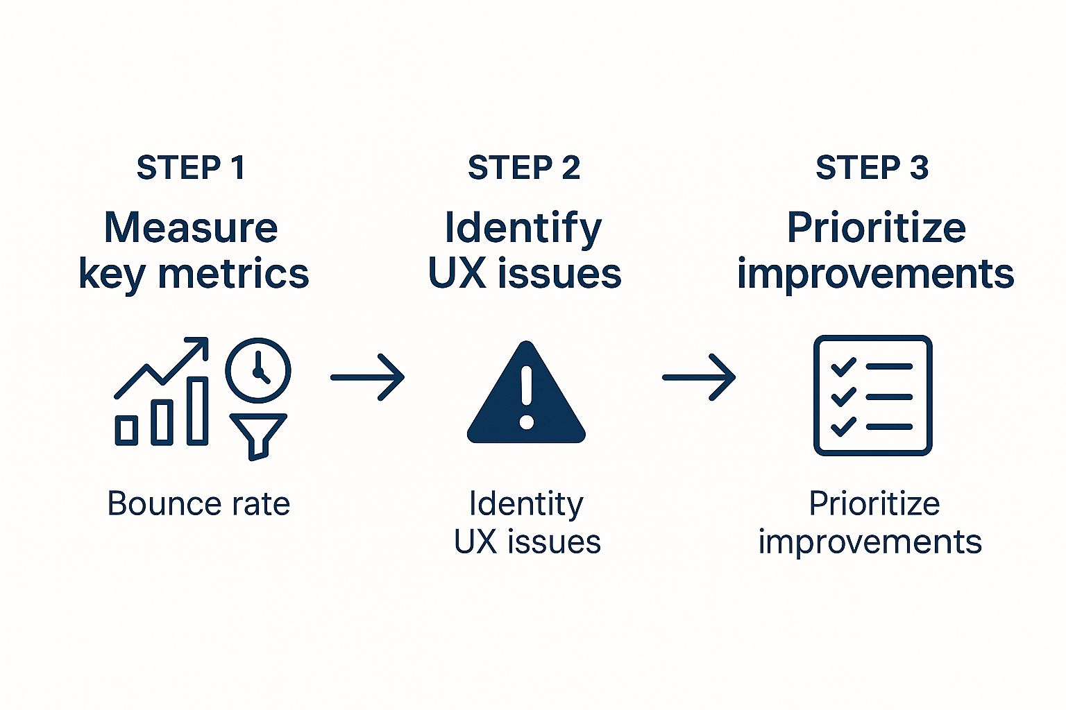
This flow—from measurement to prioritisation—is what turns all your raw data into a clear, actionable roadmap for making real improvements.
Here are the main areas you should be focusing on during your hands-on analysis:
- Navigation and Information Architecture: Can people actually find what they’re looking for? Is the main menu intuitive, or is it a confusing mess? Are the page labels clear? A clunky navigation structure is one of the quickest ways to make someone hit the back button.
- Form Design and Functionality: Look at every single form on your site—contact forms, newsletter sign-ups, and especially your checkout process. Are the fields clearly labelled? When an error happens, does the message help the user fix it, or does it just say "Error"? A poorly designed form is a guaranteed conversion killer.
- Content Readability and Clarity: Is the text easy to scan and read? You need to use short paragraphs and clear headings to break up big walls of text. Make sure you’re using language your audience understands, and ditch the industry jargon.
- Mobile Responsiveness and Performance: This is non-negotiable. Test your site properly on a mobile phone. Do all the buttons work? Is the text readable without pinching and zooming? Are pop-ups getting in the way and making it impossible to use?
Given that internet use in Australia is sky-high, with 97.1% of the population online, a dual-device focus is essential. Crucially, 94.9% of these users get online via mobile, making Australia a truly mobile-first nation. A flawless mobile experience isn’t just a nice-to-have; it’s just as important as the desktop one.
Documenting and Rating Your Findings
As you start uncovering issues, remember this: documentation is everything. A simple spreadsheet will do the trick. For every problem you spot, you need to log it properly.
- A clear description of the problem: "The 'Submit' button on the contact form is greyed out and looks disabled."
- The specific location (URL): The exact page where the issue lives.
- A screenshot: A picture is worth a thousand words. It provides undeniable proof.
- The heuristic principle it violates: "Violates Nielsen's Heuristic #7: Flexibility and efficiency of use."
- A severity rating: This is vital for deciding what to fix first.
A simple rating scale can work wonders for this:
- Critical: A total showstopper. This issue prevents users from completing a key task, like being unable to finalise a purchase.
- Major: Causes serious frustration and will probably make a lot of users give up and leave.
- Minor: A small annoyance. It won't stop a determined user, but it definitely detracts from the experience.
- Suggestion: Not really a usability problem, but an opportunity to make things even better.
This methodical approach to documenting and rating issues builds a solid, evidence-backed case for every change you eventually propose. For a more structured approach, our website optimisation checklist for business owners offers an excellent framework to follow. This detailed process ensures your audit moves smoothly from analysis to action.
Turning Insights Into Actionable Fixes

Let’s be honest. An audit packed with data is just a document until it actually sparks change. The real magic of a website user experience audit happens when you transform all those carefully gathered insights into a persuasive, actionable improvement plan. This is where your hard work moves from theory into reality.
Your final report is the tool you’ll use to get stakeholders on board and give developers a clear path forward. It needs to be compelling and built for action, not just something to be filed away. Think of it less as a dry, technical document and more as a business case for creating a better user experience.
Crafting a Persuasive Audit Report
The structure of your report is crucial. A good report guides the reader from a high-level overview right down to the nitty-gritty details. Don't just dump your findings into a document; you need to tell a story that connects user frustration directly to business outcomes.
Always start with a powerful executive summary. This is easily the most important part of the entire report, as it’s often the only section that busy stakeholders will read. It should sum up the most critical issues, their potential impact on the business, and your top-level recommendations.
After the summary, you need to organise your detailed findings logically. Grouping issues by theme or by a stage in the user journey is far more effective than just presenting a random list.
- By Theme: Group related problems together, like "Navigation & Wayfinding Issues," "Form Usability Problems," or "Mobile Experience Friction."
- By User Journey: Structure your findings around key pathways, such as "New Visitor Onboarding," "Product Discovery," or "The Checkout Process."
This thematic approach helps people see the patterns and understand the scale of the problems, which makes your recommendations feel more cohesive and strategic.
From Vague Problems to Crystal-Clear Recommendations
Identifying a problem is only half the battle. A great audit provides concrete, specific solutions for every single issue it raises. Vague suggestions just create ambiguity and lead to inaction, so you have to be prescriptive.
Avoid lazy recommendations like "Improve the navigation" or "Make forms better." These statements don't give your team any real direction. Instead, you should offer a clear, testable hypothesis for how to improve things.
For example, instead of saying: “The main menu is confusing.”
Propose this: “Simplify the main menu by merging the ‘Services’ and ‘Solutions’ categories into a single ‘What We Do’ section. Then, conduct an A/B test on the new layout against the original to measure changes in user engagement and bounce rate on key pages.”
The second version is a world away from the first. It identifies the problem, proposes a specific fix, and even includes a method for validating the change. This is the level of detail that empowers your team to take immediate, confident action.
An actionable recommendation does three things perfectly: it clearly states the problem, provides a specific proposed solution, and outlines a way to measure the impact of the change. This approach removes guesswork and builds momentum.
Prioritising Fixes with an Impact vs. Effort Framework
Once you have your list of detailed recommendations, you’ll probably face a new challenge: where on earth do you begin? Not all fixes are created equal. Trying to tackle everything at once leads to burnout and a diluted focus. This is where a prioritisation framework becomes essential.
A simple but incredibly powerful method is the Impact vs. Effort matrix. This helps you visually map each proposed fix to figure out its strategic value.
You categorise each recommendation based on two simple factors:
- Impact: How much will this fix improve the user experience or affect key business metrics (like conversions or leads)? This can be high or low.
- Effort: How much time, money, and technical resources are needed to implement this fix? This can also be high or low.
This creates four very clear quadrants:
- Quick Wins (High Impact, Low Effort): These are your top priorities. They deliver significant value with minimal resource drain. An example might be clarifying the headline on a key landing page.
- Major Projects (High Impact, High Effort): These are significant initiatives that can deliver transformative results but require careful planning and investment, such as a full checkout process redesign.
- Fill-Ins (Low Impact, Low Effort): These are minor tweaks you can address when you have spare capacity. Think of fixing a typo or slightly adjusting button colours for consistency.
- Reconsider (Low Impact, High Effort): These are tasks to question or shelve. The return on investment simply isn't there.
By mapping your findings this way, you create a practical, prioritised roadmap. It ensures your team focuses its energy on the changes that matter most, demonstrating the profound importance of website optimisation for UX by delivering tangible results, fast. This structured approach turns your website user experience audit from an insightful report into a powerful catalyst for growth.
Your Common UX Audit Questions Answered
Diving into your first website user experience audit can feel a bit overwhelming. As you get started, you'll find that a few common questions almost always come up. We've gathered the most frequent ones right here to give you clear, straightforward answers and help you move forward with confidence.
Think of this as your go-to guide for clearing up any confusion, making sure your audit is as smooth and effective as it can be.
How Often Should I Run a UX Audit?
There’s no magic number that fits every single business, but a solid rule of thumb is to conduct a full, comprehensive UX audit at least once a year. This gives you a regular, big-picture look at your site’s overall health and performance.
That said, you shouldn’t wait a full year to check in on your most valuable pages. For the critical parts of your website—think the checkout process, key service pages, or your main lead generation forms—it's smart to run smaller, more focused audits every three to six months.
The real key is to see your website user experience audit as an ongoing process, not just a one-off project. It should be a continuous cycle of improvement, especially after major site updates, redesigns, or shifts in your business goals.
This consistent approach helps you catch friction points before they grow into major problems, keeping your site perfectly aligned with what your users expect.
Can I Perform a UX Audit Myself or Do I Need an Agency?
You can absolutely run a valuable UX audit on your own, especially if you have a smaller website and you're willing to put in the time to learn the ropes. Getting your hands dirty is a fantastic way to develop a much deeper understanding of your users.
By using the heuristic evaluation principles we've covered and tapping into accessible tools like Google Analytics for numbers and Hotjar for user behaviour insights, you can uncover some serious issues that are holding back your user experience. This DIY method is both cost-effective and empowering.
However, bringing in an agency or a freelance UX specialist has some clear advantages:
- An Unbiased Perspective: It's incredibly difficult to be objective about something you’ve built. An external expert brings in fresh eyes, free from the internal biases or assumptions you have about how users should be navigating your site.
- Deeper Expertise: Professionals have worked across countless industries and have access to advanced user testing panels and specialised software. This can be a game-changer for more complex websites.
- Validation: An external audit can either confirm or challenge what you've found internally. This gives you much more confidence when you need to present your findings and recommendations to stakeholders.
The right choice really comes down to your budget, timeline, and how complex your site is. Many businesses find a hybrid approach works best—they handle regular internal checks themselves and then bring in an expert for a deep-dive audit once a year. A great first step is to explore professional services for website design and optimisation to get a sense of what’s possible.
What Is the Difference Between a UX Audit and a UI Audit?
This is a really common point of confusion, but the difference is pretty important. The simplest way to think about it is function versus form.
A UX (User Experience) audit is all about the overall journey and how effective it is. It digs into questions about usability and logic:
- Is the user’s path from A to B intuitive?
- Can people achieve what they came to do without getting frustrated?
- Is the site structure logical and easy to get around?
On the other hand, a UI (User Interface) audit zeroes in on the visual and interactive elements—the look and feel of the site. It’s about checking the visual signposts that guide the user.
- Are the buttons, fonts, and colour scheme consistent with the brand?
- Is there enough visual hierarchy to guide the user's eye?
- Are the interactive elements like sliders and menus aesthetically pleasing and cohesive?
A thorough website user experience audit will almost always touch on UI elements, because clunky UI choices inevitably create a poor UX. But the core focus remains distinct. UX is about how the journey works, while UI is about how the visual pieces of that journey look and feel.
At Titan Blue Australia, we've spent over 25 years helping Australian businesses grow with custom digital strategies that get results. If you're ready to turn your website into a powerful asset, explore our services at https://titanblue.com.au.