Stay ahead with the latest tips, trends, and insights from the Titan Blue team , straight from the studio in Broadbeach.

TL;DR:
- Most Australian businesses have mobile sites, but over half of mobile visitors leave within seconds, costing revenue. Effective mobile design improves user experience and boosts conversions by addressing load times, layout stability, and accessibility. Continuous monitoring and iterative improvements are essential for sustained growth in a mobile-first world.
Most Australian business owners have a mobile site. Yet more than half of all mobile visitors leave within seconds of arriving. That silent exodus costs real money every single day. Many sites still underperform on mobile Core Web Vitals, which means the opportunity to pull ahead of local competitors is very much alive. This guide cuts through the noise and gives you a clear picture of what strong mobile web design actually looks like, why it matters for growth, and the practical steps you can take to improve your results starting now.
Table of Contents
- Why mobile web design makes or breaks local business growth
- Core elements of effective mobile web design
- How to measure and improve mobile website performance
- Real-world results: Case studies and common pitfalls
- What most experts miss about mobile web design
- Take the next step: Professional mobile web design solutions
- Frequently asked questions
Key Takeaways
| Point | Details |
|---|---|
| Mobile design drives sales | A strong mobile web experience can dramatically increase conversion rates and online sales for local businesses. |
| Field data reveals true issues | Measuring performance using real-user mobile data highlights problems lab tests often miss. |
| Continuous improvement is crucial | Ongoing testing and updates are needed to keep up with evolving user expectations and device trends. |
| Competitive advantage for SMBs | Most local competitors still underperform on mobile—optimising your site offers a clear edge. |
Why mobile web design makes or breaks local business growth
Mobile is not a secondary channel anymore. For most local Australian businesses, it is the primary way customers first encounter your brand. A slow, clunky, or confusing mobile experience sends those customers straight to a competitor.
First impressions form fast. Research consistently shows that visitors judge a website within the first few seconds of landing. If your page loads slowly, shifts around as content appears, or forces users to pinch and zoom to read text, they leave. They do not come back. That reaction is not irrational; it reflects the expectation that a professional business maintains a professional presence everywhere, including on a phone screen.
The business case is straightforward. Responsive design reduces friction for touch navigation, form completion, and content layout stability on phones, which directly lifts conversion rates. Fewer obstacles between a visitor and a purchase or enquiry means more revenue.
Three core reasons mobile design is business-critical for local SMBs:
- Customer expectations. Shoppers and service seekers expect pages to load in under three seconds. Anything slower feels broken.
- Competitive advantage. In 2026, only 48% of sites pass all Core Web Vitals on mobile. Your local competitors are largely still struggling. That is a gap you can step into.
- Local search behaviour. Google prioritises mobile-ready sites in local search results. If your site does not perform on mobile, your visibility in maps and organic results suffers directly.
“A poor mobile experience is not just an inconvenience. It is a vote of no confidence in your business.”
Our small business website tips and the detailed breakdown of responsive web design benefits show just how significant these gains can be. The data from results from mobile-friendly sites backs this up with real business outcomes.
Core elements of effective mobile web design
Understanding the impact is one thing. Knowing what to actually build is another. Effective mobile web design is not simply making your desktop site shrink to fit a smaller screen. It requires deliberate choices at every layer of the site.
Responsive layouts adapt automatically to any screen width, ensuring content never overflows or disappears. This is the foundation, not the finish line.
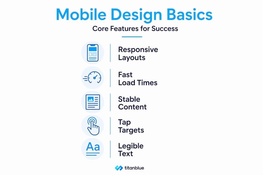
Fast load times are non-negotiable. Large uncompressed images, bloated scripts, and render-blocking code all slow pages down. Every extra second of load time reduces the chance a visitor stays.
Stable content presentation means eliminating layout shift, which is when elements jump around as the page loads. This is measured by a Core Web Vital called Cumulative Layout Shift (CLS). Visitors find it disorienting, and Google penalises it in rankings.
Accessible tap targets are buttons and links large enough to tap accurately with a finger. Tiny targets cause frustration and mis-taps. The standard minimum is 48 pixels by 48 pixels.
Legible text requires font sizes no smaller than 16 pixels for body copy and sufficient contrast between text and background colours.
There is also an important distinction between mobile-friendly and mobile-first design. Mobile-friendly adapts a desktop layout for smaller screens. Mobile-first builds from the smallest screen upward. The mobile-friendly best practices for local businesses explain this in more detail. For future-proofing your site, mobile-first is the stronger approach.
For SMBs, the methods that matter most are measuring performance on real mobile traffic, eliminating layout shift and slow-loading primary content, and ensuring tap-friendly, readable interfaces throughout.
Here is how average sites compare to top-performing ones across key metrics:
| Metric | Average site | Top-performing site |
|---|---|---|
| Page load time (mobile) | 5 to 8 seconds | Under 2.5 seconds |
| Cumulative Layout Shift | Above 0.1 (failing) | Below 0.1 (passing) |
| Interaction to Next Paint | Above 200ms | Under 200ms |
| Tap target compliance | Partial | Full |
| Bounce rate (mobile) | 65 to 80% | 35 to 50% |
| Mobile conversion rate | 1 to 2% | 3 to 5% |
These numbers represent genuine differences in business outcomes, not just technical scores.
Pro Tip: Do not rely solely on automated testing tools. Test your site on actual devices with real SIM connections, including 4G rather than Wi-Fi. The steps to mobile-friendly design are far more effective when you validate against real-world conditions. Automated tools can miss friction points that real users encounter immediately.
Good user experience principles underpin all of these elements. Mobile design is ultimately about removing barriers between your customer and the action you want them to take.
How to measure and improve mobile website performance
Knowing your site needs work is step one. Knowing exactly what to fix and how to track progress is what turns awareness into results.
Why field data matters more than lab scores. Lab tools simulate a user visit under controlled conditions. Field data, collected from real users visiting your site on real devices, reflects what your actual customers experience. Mobile performance work should prioritise field data and real-user conditions, such as those captured through Chrome UX Report (CrUX) and Real User Monitoring (RUM), because lab scores can differ substantially from actual user experience.
Here is a straightforward process to audit and improve your mobile site:
- Run PageSpeed Insights. Visit the free PageSpeed Insights tool and enter your URL. Select the mobile tab. Look at the field data section first, which shows real-user Core Web Vitals, then review the lab data for diagnostic details.
- Check your Core Web Vitals. Focus on three scores: Largest Contentful Paint (LCP, how fast the main content loads), Interaction to Next Paint (INP, how responsive the page feels), and Cumulative Layout Shift (CLS, how stable the layout is).
- Fix tap target errors. PageSpeed will flag buttons or links that are too small or too close together. Correct these in your site’s stylesheet or CMS settings.
- Address layout shift. Assign explicit width and height attributes to images and video embeds so the browser reserves space before they load.
- Reduce render-blocking resources. Scripts and stylesheets that load before content is visible delay LCP. Defer non-critical scripts and inline critical CSS where possible.
- Compress images. Convert images to modern formats like WebP and serve appropriately sized versions for mobile screens.
Here is a quick comparison of the main tools available to you:
| Tool | Data type | Best used for | Limitation |
|---|---|---|---|
| PageSpeed Insights (field data) | Real-user (CrUX) | Reflecting actual visitor experience | Requires sufficient traffic to populate |
| Lighthouse | Lab (simulated) | Diagnosing specific issues in development | May not match real-user conditions |
| Chrome UX Report (CrUX) | Real-user | Comparing your site against competitors | Technical to access without a tool |
The responsive design solutions that align with these audit findings will deliver the most measurable improvement. Understanding mobile-first design impact helps frame why these fixes matter beyond just scores. For a broader grounding, the mobile-first indexing basics explain how Google uses your mobile site as the primary version for ranking.
Pro Tip: Set a calendar reminder to re-run your audit every three months. Mobile usage patterns, device types, and Google’s scoring criteria all shift over time. A site that passed its Core Web Vitals after a redesign can gradually slip back below threshold as new content and plugins are added.
Real-world results: Case studies and common pitfalls
Strategy and measurement mean nothing without results. Let us look at what actually happens when businesses commit to strong mobile web design, and what to avoid.

The business that doubled mobile sales. One SMB implemented a thorough mobile-first responsive redesign, addressing load speed, tap targets, and layout stability. The outcome was a 98% increase in mobile sales following the change. That is not a marginal improvement. That is a business transformation driven by removing friction from the mobile journey.
The patterns that produce these results are consistent. The sites that win share several traits: they load fast on real mobile networks, navigation is visible and easy to use with one thumb, forms are short with large input fields, and calls to action are prominent without being intrusive.
Common pitfalls that cost local businesses dearly include:
- Slow initial render. When the first visible content takes more than three seconds to appear, most visitors have already left.
- Hidden or hamburger navigation menus. Collapsing your entire menu behind a small icon reduces engagement. Important pages become hard to find.
- Small tap targets. Buttons under 44 pixels in height frustrate users and increase errors. This is especially critical for phone number links and enquiry buttons.
- Unreadable fonts. Fonts smaller than 16 pixels on mobile cause eye strain and signal an unprofessional finish.
- Unoptimised images. A single large hero image can add several seconds to load time on mobile networks.
“Many businesses fix their mobile site once and assume the job is done. That thinking is precisely what keeps them stuck.”
The design tricks for SMBs that produce sustained results treat mobile optimisation as an ongoing practice rather than a single project. Revisiting performance data, collecting real customer feedback, and making iterative improvements are what separate consistently growing businesses from those that plateau.
The difference between a one-off fix and a genuine mobile strategy is in the commitment to monitoring. Devices change. Operating system updates change how browsers render pages. New content gets added. Each of these events can introduce new issues. The businesses that stay ahead test regularly and fix problems before customers encounter them. The proof is in the mobile-friendly design wins achieved by those who maintain that discipline.
What most experts miss about mobile web design
Here is the uncomfortable truth: most advice about mobile web design stops at the launch. You will hear plenty about responsive frameworks, image compression, and Core Web Vitals scoring. What you rarely hear is that the real gains happen in the months after launch, not on day one.
We see this pattern constantly. A business invests in a mobile redesign. Scores improve. Traffic stabilises. And then, quietly, they stop looking. New pages get added without the same care. Plugin updates slow things down. A new promotional banner shifts the layout. Within six months, many of the gains have eroded and nobody noticed because they stopped measuring.
The businesses that achieve lasting results treat mobile experience the way they treat customer service. It is not something you set up once. It is something you actively manage. That means reviewing field data over lab benchmarks regularly, because real users and real local customers are the only meaningful test of whether your site is doing its job.
The mindset shift is this: your mobile site is never finished. It is a living part of your business that needs attention and iteration, especially as more of your local competitors eventually catch up. The businesses that start treating mobile performance as a continuous investment now are the ones that will be hardest to displace in a mobile-first world.
Take the next step: Professional mobile web design solutions
You now have a clear picture of what strong mobile web design requires and what it delivers. The next question is whether your current site is meeting that standard or quietly costing you customers every day.
At Titan Blue, we work with local Australian businesses across the Gold Coast and beyond to build sites that perform where it counts: on the phones of your actual customers. Our Web Design Gold Coast Australia service is built around measurable results, not just attractive visuals. Every project we take on prioritises mobile performance, local search visibility, and the user experience design principles that turn visitors into leads and leads into loyal customers. If you are ready to stop losing mobile visitors and start converting them, get in touch with our team today.
Frequently asked questions
How do I know if my website performs well on mobile?
Test your website using Google PageSpeed Insights and review the real-user Core Web Vitals field data, focusing on mobile-specific issues such as speed and interactivity. Field data via CrUX reflects what your actual visitors experience, making it a more reliable measure than simulated lab scores.
What is the difference between mobile-friendly and mobile-first web design?
Mobile-friendly design adapts an existing desktop layout for smaller screens, while mobile-first design builds from the mobile experience upward to ensure everything works seamlessly on phones. Mobile-first execution reduces friction for touch navigation, forms, and content layout stability in ways that mobile-friendly approaches often miss.
How often should I update my mobile web design?
Review your mobile site’s performance every few months or after any major software updates, new content additions, or plugin changes. Real-user conditions can shift after initial fixes, so regular monitoring prevents gradual performance erosion that goes unnoticed until customers start leaving.
Can better mobile design really boost my sales?
Yes, the impact can be dramatic. Mobile sales increased 98% for one business after a well-executed mobile-first responsive redesign, demonstrating that removing friction from the mobile experience produces concrete and significant revenue gains.
Recommended

AI Search Strategy Australia: A 7-Step Framework for Getting Found in ChatGPT, Perplexity, and Google AI
A practical 7-step AI search strategy framework for Australian businesses wanting to get cited in…

AI Search Marketing Australia: The Complete Strategy Guide for 2026
AI search marketing means getting your Australian business cited by ChatGPT, Perplexity, and Google AI…

AI Visibility Optimisation Australia: How to Measure, Benchmark, and Grow Your Brand’s Presence in AI Search
AI visibility optimisation helps Australian businesses get cited by ChatGPT, Google AI Overviews, and Perplexity.…