Stay ahead with the latest tips, trends, and insights from the Titan Blue team , straight from the studio in Broadbeach.
A lot of agencies are in the same spot right now. The homepage looks polished, the photography is decent, the branding feels professional, and yet the site isn't producing the volume or quality of enquiries the business expected.
That usually happens because the homepage was designed like a brochure instead of a system. It introduces the brand, but it doesn't move buyers, sellers, landlords, or investors into the next action fast enough. In real estate, that gap matters. People arrive with intent. They want to search, compare, validate, and contact. If the homepage makes them work for any of that, they leave.
Good real estate homepage design sits in the middle of two demands that often pull against each other. It needs visual confidence, but it also needs speed, search visibility, local relevance, and a very clear conversion path. That's even more important in Australia, where local suburb intent, mobile browsing behaviour, and trust cues heavily shape whether a visitor stays or bounces.
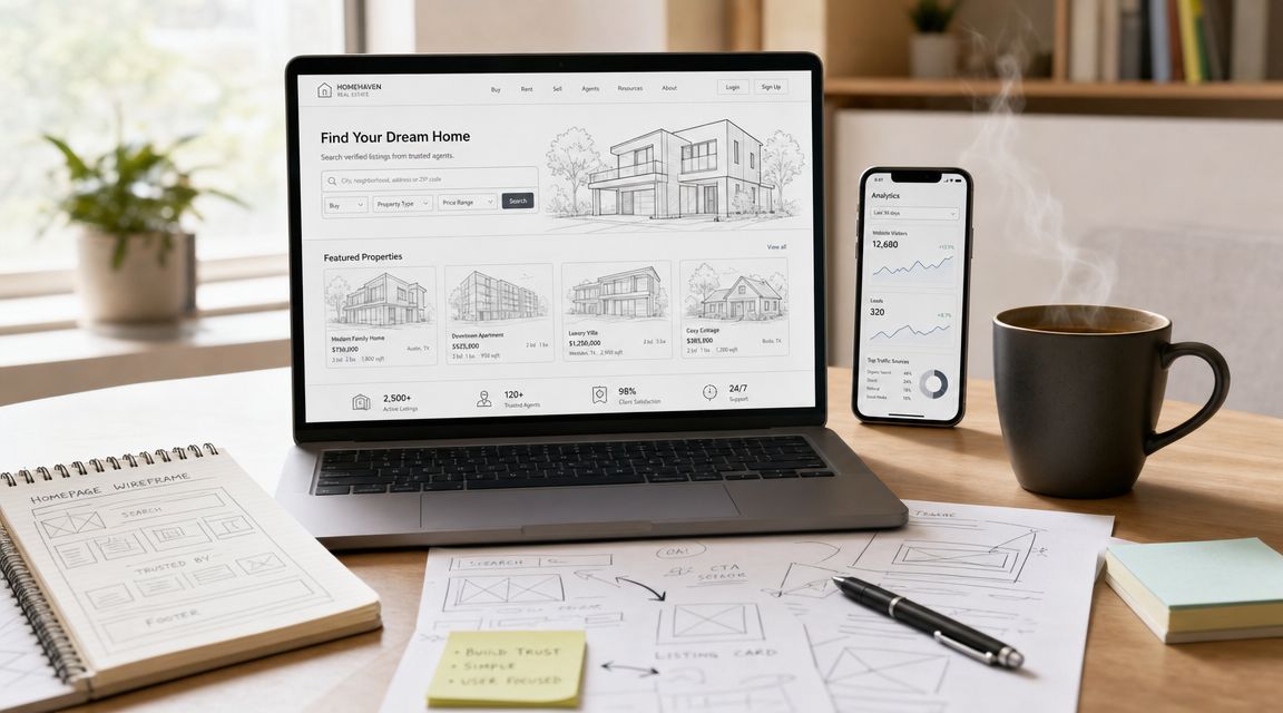
Your Homepage Is More Than Just a Digital Brochure
A real estate homepage isn't there to welcome visitors and look impressive. Its job is to direct the right people to the right action with as little friction as possible.
That sounds obvious, but plenty of agency sites still put aesthetics first and utility second. They open with oversized sliders, vague taglines, and menu structures built around the business rather than the user. The result is a homepage that feels premium but performs like a dead end.
The better view is simpler. Your homepage is the digital front door, but it's also a routing engine. It should quickly answer three questions. What area do you serve? What can the visitor do here? Why should they trust you enough to keep going?
For Australian businesses, the broader lesson is the same one discussed in website design benefits for Australian SMBs. Design isn't just presentation. It's part of how the business earns attention, creates confidence, and captures demand.
Practical rule: If a first-time visitor can't reach listings, suburb pages, a valuation path, or a contact action within seconds, the homepage is underperforming.
The strongest homepages don't try to say everything. They create momentum. They use visual hierarchy to focus attention, content hierarchy to reduce confusion, and technical performance to keep high-intent users from dropping off before the page has even settled.
That's the difference between a website that looks good in a meeting and one that helps generate actual business.
Laying the Foundation for a High-Converting Design
The design phase gets too much attention. Strategy is where the homepage wins or loses.
Real estate is already crowded online. The National Association of REALTORS notes that 73% of agents have a website, which means your site isn't competing on existence. It's competing on quality, clarity, speed, and trust signals, as noted in this overview of real estate web design trends.
When agencies skip the foundation work, they usually end up with the same problems. Too many calls to action. Generic messaging. Navigation that reflects internal departments instead of real buyer tasks. A homepage that feels busy without feeling useful.
Start with a local buyer and seller picture
Demographics alone won't help much. "Families" or "investors" are too broad to shape a homepage.
A practical homepage brief needs behavioural detail. Are people landing on the site looking for active listings, suburb guidance, a rental appraisal, an agent profile, or proof that your team knows the area? Those intents change what belongs above the fold and what can sit lower on the page.
For a Broadbeach agency, for example, local buyers may care about beach proximity, apartment living, walkability, and nearby amenities. A regional agency may need to prioritise land size, school access, travel time, and council area relevance. Same industry, different homepage logic.
Looking at strong international examples can help sharpen your judgement. A curated set of best European real estate websites is useful for studying layout patterns, search placement, and how premium brands handle property discovery without overloading the page.
Define conversions before you design screens
Most agencies say they want more leads. That's too loose to guide a homepage.
A better approach is to rank conversions by value and immediacy. A buyer search, an appraisal request, a rental enquiry, and a direct phone call are all useful, but they don't belong in equal positions. The homepage needs a primary action and a supporting action, not five competing priorities.
Use a mix like this:
- Primary conversion: Property search, sales appraisal, rental appraisal, or inspection enquiry.
- Secondary conversion: Contact form submission, phone click, or agent profile visit.
- Micro-conversion: Newsletter sign-up, saved search, market update request, or suburb page visit.
That structure helps you decide what appears first, what gets visual emphasis, and what can sit deeper in the page flow.
Map the user journey before anyone opens Figma
A strong homepage isn't a collection of sections. It's a sequence.
The most effective way to plan it is to map first-click intent and then build the rest of the journey around it. That means asking what a person should do immediately after landing, what information they need next, and what proof removes doubt before they convert.
A simple journey might look like this:
- Arrival: User lands on the homepage from search, social, or branded traffic.
- First action: They search listings, choose a suburb, or request an appraisal.
- Validation: They scan recent sales, reviews, agency credentials, or agent expertise.
- Commitment: They enquire, call, or move into a more specific landing page.
If any step feels vague, the design usually becomes vague too.
Responsive structure also matters at the planning stage, not after the mock-up. At this stage, a resource on responsive web design for UX, SEO and conversions proves relevant. Mobile layouts, tap targets, menu depth, and CTA placement need to be solved in the blueprint, not patched during development.
A homepage works best when every section earns its place by moving the visitor closer to one defined action.
That is the foundation. Not colours, not fonts, not animation. A homepage becomes effective when strategy decides what design must do.
Crafting the High-Impact First Impression
The highest-value part of the homepage is the first screen. Not because it's fashionable to obsess over "above the fold", but because users make an immediate judgement about relevance there.
Many homepage designs still waste that moment. They lead with vague brand slogans, oversized navigation, or autoplay visuals that look expensive but don't answer a practical question. In Australian property search, that first screen has to work harder.
Many real estate homepage guides miss how to design for first-click intent on mobile. In Australia, where mobile browsing dominates property discovery, a homepage needs one clear property search or service action, one trust cue, and a fast route to suburb pages, rather than large desktop-first hero sections and broad navigation, as discussed in this piece on real estate homepage allocation.
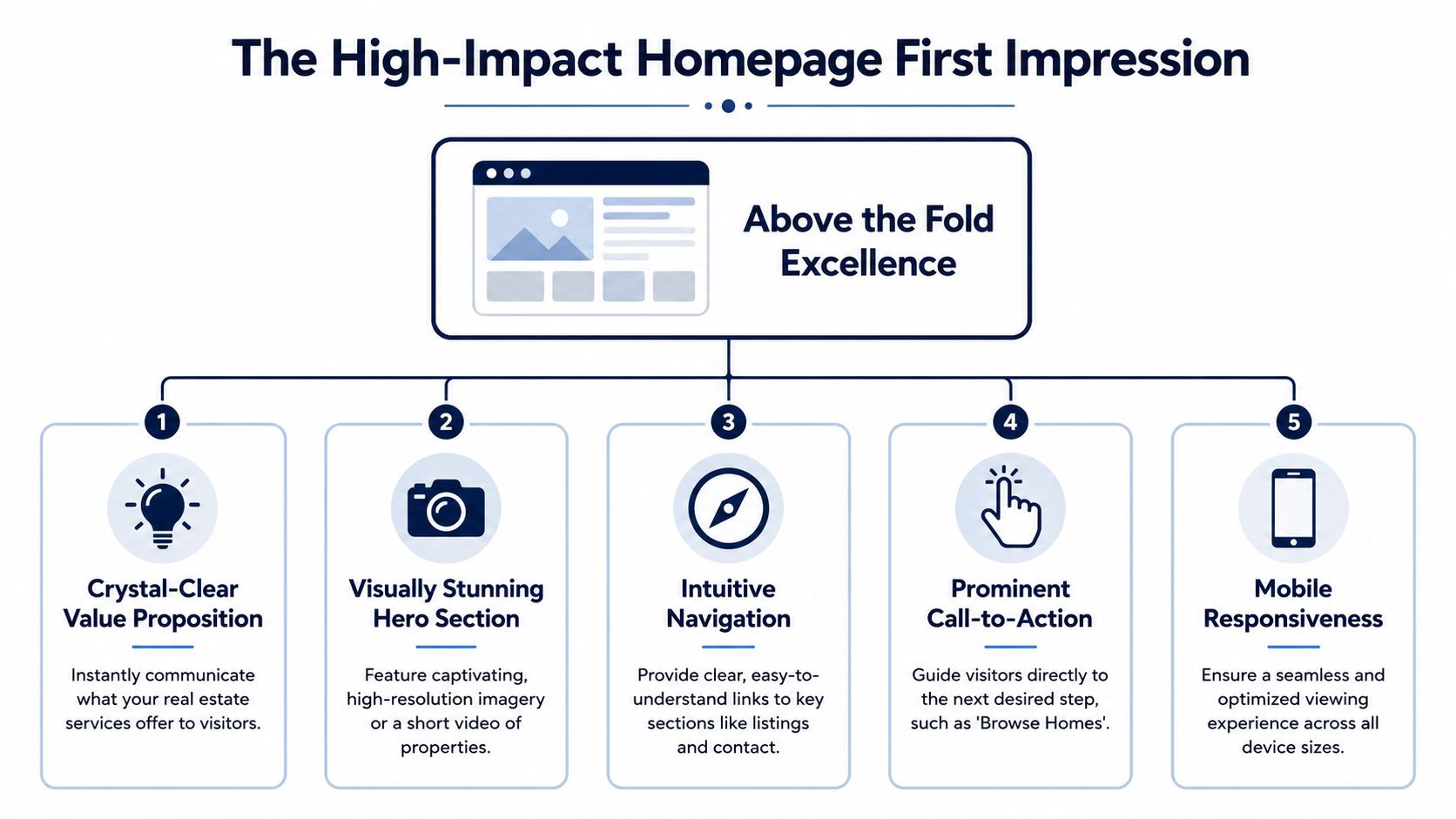
Give the hero section one job
Your hero doesn't need to tell the whole brand story. It needs to direct intent.
That usually means a short value proposition tied to location and service, backed by a single primary action. "Search Gold Coast properties", "Request a property appraisal", or "Find homes in Mermaid Beach" will outperform copy that's polished but abstract.
The same rule applies to buttons. One dominant CTA is stronger than three equal ones. If search is your top conversion path, it should own the visual hierarchy. If seller leads matter more, then the appraisal path should.
A useful way to pressure-test the hero is to remove the logo mentally and ask whether the section still makes sense. If not, the message is relying on brand familiarity instead of clarity.
Use real local visuals, not decorative filler
Photography on a real estate homepage isn't background decoration. It's evidence.
Use local property imagery, recognisable area context, and visuals that support the type of stock or service you sell. Stock photos might fill space, but they don't build confidence. They flatten local identity and make agencies look interchangeable.
The strongest hero images also support readability. If the photo fights with the headline, search field, or CTA, it's not doing its job. The image should frame the action, not overpower it.
Many premium-looking homepages often fail. They prioritise drama over function. Big cinematic images can work, but only if the text remains clear and the page still loads quickly on mobile.
Keep navigation narrow and intentional
Broad navigation is usually a sign that nobody made hard decisions.
A homepage for real estate doesn't need to expose every page template, service category, and office detail in the first menu. It needs a short path to core tasks. Listings. Suburbs. Sell. Rent. Contact. That kind of structure is easier to scan and easier to tap on smaller screens.
Good navigation also reduces dependence on scrolling. Some users will scroll. Some won't. The homepage should support both behaviours.
A practical above-the-fold layout usually includes:
- A short headline: Tied to location and service, not agency ego.
- A visible search function: Prominent enough to become the first interaction.
- One trust cue: Review snippet, years in business, local expertise statement, or credential reference.
- A restrained menu: Focused on top user tasks.
- A mobile-safe CTA: Large enough to tap comfortably without accidental misses.
Build for thumb behaviour, not desktop habits
The homepage must feel native on a phone. That doesn't just mean responsive. It means prioritised.
A mobile-first homepage should place the search bar or lead action where the thumb reaches naturally. It should avoid cramped controls, hidden filters, and oversized text overlays that push useful content too far down. It should also give users a fast route into suburb pages because local browsing often starts with area interest before individual listings.
If you're reviewing examples of real estate website designs, look less at how "beautiful" the homepage appears on a large monitor and more at whether it makes the first action obvious on a phone.
The first screen doesn't need more creativity. It needs more discipline.
That's the trade-off at the centre of real estate homepage design. The homepage can still feel premium, but the premium experience comes from clarity, confidence, and speed to action. Not from visual excess.
Building Trust and Showcasing Property Listings
Once the visitor moves past the first screen, the homepage has a new job. It needs to answer the silent question that follows interest. Why should I trust this agency?
That answer doesn't come from a generic claim about service. It comes from proof. Visitors want signs that your agency is active, local, competent, and transparent. They also want listing previews that help them scan without friction.
According to a 2024 Statista survey, Australian property seekers rate photos and detailed listing information as the most valuable features of real estate websites. This confirms that a homepage must immediately surface high-quality imagery and clear property information rather than burying it below the fold, as referenced in this summary of real estate website design preferences in Australia.

What users look for after the hero
Think about the scroll from the visitor's side. They clicked through, saw the search bar, maybe noticed your local positioning, and then kept moving. At that point, they aren't looking for more slogans. They want reassurance.
That reassurance usually comes from a mix of elements:
- Recent proof of activity: Sold properties, leased properties, current listings, or inspection opportunities.
- Social trust: Reviews, testimonials, and signals that real clients have worked with you successfully.
- Local expertise: Suburb knowledge, neighbourhood familiarity, and evidence that the agency isn't generic.
- Human credibility: Agent profiles, credentials, and approachable contact options.
One strong trust section will outperform three weak ones. If your reviews are thin, don't force a review carousel. If your agents are the key differentiator, feature them properly instead.
Design listing cards for scanning speed
A homepage listing preview isn't the place to cram every feature into a tiny card. It should help users decide whether to click.
In practice, the strongest property cards prioritise the essentials. Lead image, suburb or location, price position where appropriate, bed and bath count, and a clear CTA. If the user has to hunt for the basics, the card has failed.
This is one of those areas where agencies often chase style at the expense of usability. Tiny type, hidden details, hover-only interactions, and oversized white space may look elegant in a static mock-up, but they slow the user down in live browsing.
A better approach is blunt and effective:
- Lead with the image: The photo should be strong enough to create interest instantly.
- Keep metadata obvious: Beds, baths, parking, and location need to scan in a glance.
- Use one next step: "View property" or equivalent. Don't clutter the card with competing actions.
- Maintain consistency: Mixed card styles make the page feel unstable.
If you want to benchmark how listing collections are presented in a more inventory-led environment, it can help to explore properties managed by AIM and study how card-based browsing supports scan behaviour.
Trust signals should feel earned
Visitors can tell when a homepage is padding itself with decorative badges and self-congratulation. Trust content works when it feels specific and grounded.
That might mean a short testimonial near a relevant CTA, a concise "recently sold" strip, a suburb expertise section, or a short profile block that shows the people behind the business. It can also mean professional imagery. In property marketing, image quality has a direct effect on perceived credibility, which is why investment in business photography often lifts the quality of the whole homepage, not just the listing section.
A trust signal only works if it helps the visitor make a decision. If it exists to flatter the agency, it belongs somewhere else.
The strongest homepage flow after the hero usually feels like this. Search or orientation first. Then proof. Then listings. Then deeper routes into suburb pages, appraisals, agents, or contact. That's what keeps the page useful rather than ornamental.
Advanced Optimisation for Performance and Search
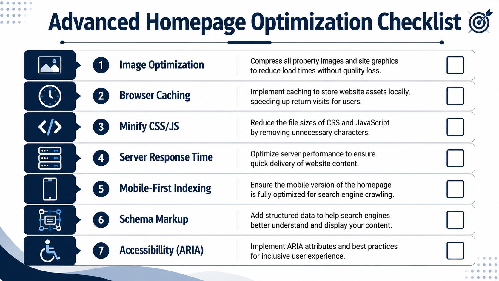
A real estate homepage can look excellent in design review and still fail in production because it loads poorly, hides key content from search engines, or creates too much friction on mobile.
A lot of beautiful work gets undermined. Heavy hero images, layered scripts, sliders, chat widgets, map embeds, review plugins, and animation libraries all stack up. Individually they seem manageable. Together they slow the experience and weaken the very page that's meant to capture first intent.
Best practice for a real estate homepage is to design mobile-first around search intent, with a prominent property search bar and fast-to-scan property cards. Core Web Vitals strongly influence abandonment, and practical performance targets are sub-3-second load times on 4G and PageSpeed or UX scores above 90, based on this guide to real estate website design best practices.
Performance problems usually come from design decisions
Most homepage speed issues aren't mysterious. They're caused upstream.
Common offenders include uncompressed property photos, autoplay video, oversized font files, third-party widgets that block rendering, and homepage templates trying to do too much at once. Developers can optimise a lot, but if the page architecture is bloated, technical clean-up only goes so far.
A practical optimisation workflow usually includes:
- Compressing imagery: Especially hero assets and featured listing photos.
- Deferring nonessential scripts: Reviews, chat tools, and marketing tags shouldn't delay first interaction.
- Reducing homepage clutter: Fewer widgets often means faster load and clearer conversion.
- Testing on real mobile devices: Not just desktop emulation in a browser.
Search visibility starts with content structure
Search engines and AI systems don't experience your homepage the way a designer does. They parse structure, context, semantic relationships, and technical signals.
That means the homepage needs clean hierarchy. One clear primary topic. Supporting content blocks that establish service and location relevance. Internal links into suburbs, listings, and service pages. Strong headings that describe what the page covers.
For real estate homepage design, local SEO matters most when it is built into the information architecture rather than bolted on through awkward keyword stuffing. A homepage that links naturally into suburb pages, valuation pages, and agency service pages sends much clearer signals than one that tries to rank through generic copy alone.
If search visibility is part of the growth strategy, an agency will usually need a broader framework around real estate SEO so the homepage supports, rather than competes with, deeper landing pages.
Here's a useful explainer on technical optimisation in practice:
AI search and answer-driven discovery need cleaner signals
AI-assisted search adds another layer. The homepage should give machines enough structured clarity to understand what the business does, where it operates, and how users can act next.
That doesn't mean writing robotic copy. It means using consistent page hierarchy, descriptive headings, concise service language, and structured data where appropriate. Local business schema, organisation schema, and property-related structured elements help systems interpret the page more accurately. So do internal links that clearly connect areas, services, and listings.
Accessibility belongs in this discussion too. Contrast, alt text, clear labels, and mobile-safe tap targets don't just support users. They also improve overall interface quality and reduce ambiguity in the code and content structure.
Search performance and conversion performance are connected. A faster, clearer homepage usually ranks better because it is also easier for users to understand and use.
When agencies treat performance as a finishing touch, they usually pay for it later with redevelopment work. The better move is to design with technical restraint from the start.
Implementing Your Homepage with the Right Technology
A real estate homepage can look polished in Figma and still fail in market once the technology goes live.
I see this regularly with Australian agencies. The visual design gets approved quickly, then the build phase exposes the actual constraints. Listing feeds do not sync cleanly. Forms send enquiries to a generic inbox instead of the CRM. Mobile layouts break once live property data, suburb modules, and campaign tracking are added. The result is a homepage that looks expensive but behaves like a brochure.
The stack has to support how agencies operate. On a typical AU real estate homepage, that means property search, suburb visibility, lead capture, campaign attribution, CRM handoff, and content updates by non-technical staff. If the platform cannot handle those jobs cleanly, the site becomes harder to maintain, slower to improve, and less useful as a lead-generation asset.
A technically sound AU homepage should treat property discovery as part of the conversion system, using IDX or MLS-style search, suburb-level SEO sections, and structured content blocks. The technical benchmark is pairing those UX elements with CRM-integrated enquiry forms and analytics that track lead source and CTA click-through, as outlined in this article on real estate website design best practices.
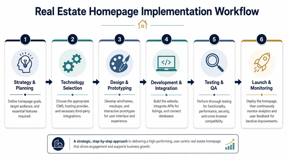
Choose a CMS based on workflow, not trend
CMS decisions usually go wrong after launch, not before it. The sales pitch sounds fine. The admin team then discovers that simple homepage edits are risky, listing modules need developer intervention, and new landing pages drift away from the original structure. Performance also suffers when the stack depends on heavy plugins or page builders that were never designed for a fast, mobile-first property experience.
A good platform choice usually balances four practical requirements:
- Editing control: Staff can update homepage sections without damaging layout or hierarchy.
- Performance discipline: The build avoids unnecessary plugin weight and media overhead.
- Integration flexibility: CRM, forms, analytics, and listing feeds connect without manual workarounds.
- Scalability: New suburb pages, agent profiles, and campaign landing pages can be added without rebuilding core templates.
One implementation option is a custom or semi-custom build designed around local real estate workflows. That matters in Australia, where agencies often need compatibility with specific CRM setups, listing data structures, and campaign processes rather than a generic brochure-site template.
Wireframe the homepage around business priority
Wireframing settles arguments early.
Before design styles enter the conversation, the homepage needs a clear order of importance. Agencies that want appraisal leads should not give equal visual weight to every possible action. Prestige agencies may need more brand expression, but they still need a direct route to listings, agent contact, or a valuation request. Good homepage structure is a prioritisation exercise, not a decoration exercise.
A practical wireframe often follows this sequence:
- Hero with primary action
- Immediate trust cue
- Featured listings or search refinement
- Suburb or neighbourhood pathways
- Agent or agency proof
- Closing CTA with contact options
That order is not mandatory. It is useful because it forces the business to decide what deserves prime space on mobile and what can sit lower on the page.
Integrate lead handling from day one
Lead capture without routing is admin debt.
Homepage forms, call clicks, appraisal requests, and listing enquiries should feed directly into the system the sales or property management team already uses. If they land in a shared inbox with no source data, the homepage cannot be improved with confidence. The team loses visibility on which CTA drove the lead, which suburb pathway influenced the enquiry, and where prospects dropped out.
This matters even more for AI search and local SEO. As answer-driven discovery sends users into a homepage with stronger intent, agencies need cleaner attribution and tighter follow-up. A beautiful page that hides lead source data makes optimisation slower and more expensive.
Agencies with investor communications, private document access, or more complex property operations may also need secure portal functionality beyond a standard form flow. In that case, reviewing Homebase investor portal solutions can help frame how portal access fits into a broader property platform instead of being awkwardly added later.
Good homepage technology should reduce friction for visitors and for the team managing enquiries, content, and reporting behind the scenes.
That is the standard to aim for. The right build supports design quality, local search visibility, mobile usability, and day-to-day operations at the same time.
Frequently Asked Questions About Homepage Design
How should AI search affect real estate homepage design
AI search rewards clarity. The homepage should state what the agency does, where it operates, and which actions the visitor can take without vague brand language getting in the way. Clear headings, suburb pathways, descriptive service copy, and structured content blocks make it easier for both search engines and AI systems to interpret the page accurately.
What are the most common homepage mistakes in real estate
The worst mistakes are usually practical, not artistic.
- Too many actions: Search, appraisal, rent, sell, buy, contact, and download all fighting for the same attention.
- Desktop-first layouts: Large visual sections that feel impressive on a monitor but bury key actions on mobile.
- Weak trust proof: Generic claims with no local evidence, recent activity, or human credibility.
- Bloated media: Heavy sliders, oversized images, and too many third-party scripts.
- Poor listing previews: Cards that hide the basic details users want to scan quickly.
How often should a homepage be refreshed
A homepage doesn't need a full redesign on a fixed schedule. It does need regular review.
Content, listings, trust signals, and CTA performance should be checked frequently. Structural redesigns make sense when the business model changes, mobile behaviour exposes friction, lead quality drops, or the current system can't support performance and search requirements properly. Small ongoing improvements usually outperform waiting years and then rebuilding everything at once.
Should the homepage try to rank for every service and suburb
No. That's usually what creates cluttered copy and confused hierarchy.
The homepage should establish the main service and area context, then route users and search engines into dedicated deeper pages. Suburb pages, sales pages, rental pages, and appraisal pages do the heavy lifting for specificity. The homepage should connect them cleanly, not replace them.
Your Blueprint for Homepage Success
A common Australian agency scenario looks like this. The homepage wins compliments in the boardroom, but mobile users still miss the valuation CTA, suburb intent is unclear to Google, and AI search tools struggle to interpret what the business does. Good homepage design fixes that gap between appearance and performance.
The blueprint is straightforward. Set a clear commercial goal. Shape the first screen around the actions buyers, sellers, landlords, and tenants take. Place trust signals where hesitation happens. Show listings in a format people can scan fast on a phone. Then support the whole page with clean technical foundations so it loads quickly, reads clearly for search systems, and gives the team reliable data to act on.
Agencies that perform well with this approach treat the homepage as a working sales asset. It helps qualify leads, strengthen local visibility, and reduce wasted traffic from users who were never a fit in the first place.
For Australian real estate brands, that balance matters. The site has to look premium enough to reflect the properties and the market position, but it also has to handle mobile-first behaviour, local SEO structure, and the growing influence of AI-generated search results. A beautiful homepage that hides intent, loads slowly, or spreads authority too thin across too many services will underperform.
Titan Blue Australia builds real estate homepages around those commercial and technical requirements, with a focus on the Australian market and measurable conversion goals.

SEO vs AEO vs GEO: What’s the Difference and Which Does Your Australian Business Need?
SEO, AEO, and GEO are three distinct but complementary disciplines. This guide explains each one,…

The Complete AI SEO Glossary: Every Term Australian Businesses Need to Know in 2026
Plain-English definitions of every AI SEO, AEO, and GEO term — from RAG and entity…
How AI Search Engines Work: The 5-Stage Pipeline Behind ChatGPT, Perplexity, and Google AI Overviews
AI search engines use a five-stage pipeline — fan-out, retrieval, passage scoring, LLM synthesis, and…