Ecommerce web design is the art and science of creating an online store that’s not just visually appealing, but also dead simple to use and fine-tuned to turn visitors into customers. It's not about making things look pretty; it’s about crafting a seamless digital shopping experience that drives sales and keeps people coming back.
Your Digital Storefront and Why It Matters
Think of your website as the digital front door to your business. In a physical shop, you wouldn't leave the aisles cluttered, hide the cash register, or lock the doors during business hours. The exact same thinking applies online. Your ecommerce web design is your store layout, your product displays, and your customer service all rolled into one. A great design builds trust instantly and guides visitors from just browsing to actually buying.
This isn’t just a technical box to tick; it’s the absolute foundation of your entire online presence. It directly shapes how potential customers see your brand and whether they feel confident enough to hand over their money. An intuitive, clean, and professional design signals that you’re a credible business. On the flip side, a confusing or outdated site will send customers running to your competitors in seconds.
The Growing Importance in Australia
The shift to online shopping is undeniable, especially here in Australia. The market is packed, which means a powerful first impression is non-negotiable. For many businesses, a thoughtfully designed website is the single most critical investment they can make.
Here's why it's so vital:
Building Trust: A professional design reassures customers that your business is legitimate and that their personal and financial details are safe with you.
Improving Usability: Clear navigation and a logical layout stop people from getting frustrated. It makes it easy for them to find exactly what they’re looking for.
Boosting Conversions: Every design choice, from the colour of a button to the steps in the checkout, is meticulously planned to encourage purchases and slash the number of abandoned carts.
The appetite for online shopping just keeps growing. Australian consumers are embracing it more than ever, with total online retail spending hitting around AU$69 billion in 2024—a massive 12% jump from the year before. This surge makes it crystal clear: you need a website that not only looks good but performs brilliantly.
Ultimately, your ecommerce site is a 24/7 salesperson, and its design dictates how effective it will be. As you'll discover, building a powerful online store means understanding why buying experiences are the future of ecommerce.
The Core Pillars of High-Converting Design
A beautiful website that doesn't sell is just a digital art piece. The real goal of ecommerce web design is to build something profitable, and that starts with a solid foundation built on proven principles. These pillars are what transform casual browsers into loyal customers by making the whole shopping experience feel effortless and persuasive.
Think of these as the unspoken rules of online retail. When you get them right, they guide a customer’s journey so naturally that the path from discovery to purchase feels completely intuitive. It’s about more than just looking good; it's about the strategic psychology behind online selling.
Let's break down these foundational elements to see why some online stores connect with their audience and thrive, while others just fall flat.
Create a Clear Visual Hierarchy
Visual hierarchy is all about telling your customer where to look without saying a single word. It’s the art of arranging elements on a page to show their order of importance, ensuring the most critical information—like your "Add to Cart" button or a special offer—grabs attention first.
Imagine walking into a physical store where everything is the same size and colour; finding what you need would be a nightmare. The same goes for your online store. By using size, colour, contrast, and placement, you can create a clear path for the user’s eye to follow. This strategic direction is what separates a confusing layout from a high-converting one.
This principle makes browsing feel instinctive. A large, bold headline is naturally read before smaller body text, and a brightly coloured button stands out against a muted background. These small cues build on each other to create a seamless user flow that leads directly to a sale.
Prioritise Intuitive Navigation
If a customer can't find what they're looking for in a few seconds, they'll leave. It's that simple. Intuitive navigation is your best defence against a high bounce rate and abandoned carts. It acts as the clear, well-labelled aisle signage in your digital store, making product discovery simple and completely frustration-free.
Your navigation menu should be logical and predictable. Stick to common terms that customers understand, like "Shop," "New Arrivals," or "Contact Us." Hiding essential categories behind confusing icons or clever but unclear labels will only create friction and cost you sales.
Effective navigation also relies on powerful search and filtering functions. Customers should be able to quickly narrow down their options by:
Price Range: Helping shoppers stick to their budget.
Size or Colour: Offering specific options for a personalised choice.
Customer Ratings: Building social proof and guiding purchase decisions.
Studies show just how critical clear navigation is for keeping potential customers on your site, as 75% of people will leave a website if they can’t find what they are looking for in under 15 seconds.
Embrace a Mobile-First Approach
These days, more customers shop on their phones than on their desktops. A mobile-first approach is no longer a recommendation; it's a non-negotiable part of successful ecommerce web design. This means designing the mobile experience first and then adapting it for larger screens—not the other way around.
This ensures the core experience is optimised for the majority of your users. On a smaller screen, every element has to be deliberate. Buttons need to be large enough for thumbs to tap easily, text must be readable without pinching to zoom, and the checkout process must be exceptionally simple.
A responsive design that just shrinks your desktop site for mobile isn't good enough. A true mobile-first strategy focuses on speed, simplicity, and ease of use, recognising that mobile users are often on the go and have less patience for slow or complicated interfaces. To learn more, you can explore the top elements for high-performing website design that are essential for success.
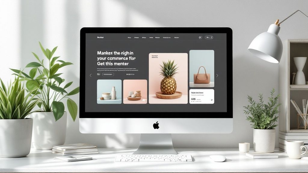
Showcase High-Quality Product Imagery
In ecommerce, your product photos are your products. Since customers can't physically touch or inspect the items, high-quality imagery is absolutely essential for building desire and trust. Your photos have to do the heavy lifting, telling a story and showcasing the true value of what you sell.
Use a variety of images for each product. This should include clean, professional shots on a white background, lifestyle photos showing the product in use, and detailed close-ups that highlight key features and textures. All this visual information helps customers make confident buying decisions.
Videos are also incredibly powerful here. A short product demonstration can answer questions and show off benefits in a way static images just can't, often leading to a significant boost in conversion rates. Investing in professional photography and videography is one of the most direct ways to increase the perceived value of both your products and your brand.
Choosing the Right Ecommerce Platform
Picking the right ecommerce platform is a bit like choosing the engine for a car. It’s the core technology that powers your entire online store, influencing everything from how you manage inventory to how smoothly your customers can check out. This decision is one of the most critical you'll make, as it forms the very foundation your business will be built on.
Getting this right isn’t about picking the most popular name. It's about taking a good, hard look at the two main approaches available and figuring out which one aligns with your business's specific needs, technical skills, and future ambitions. The two paths you can take are hosted and self-hosted solutions.
Hosted vs Self-Hosted Platforms
A hosted platform is an all-in-one service where the company provides the software, hosting, and technical support in a single package. Think of it like renting a retail space in a fully managed shopping centre. The management takes care of security, maintenance, and the building's infrastructure, leaving you to focus on arranging your products and serving customers. These platforms are generally known for their ease of use, making them a fantastic starting point for businesses without a dedicated tech team.
On the other hand, a self-hosted platform is open-source software that you download and install on your own web hosting server. This is more like buying your own commercial land and constructing your store from the ground up. You have complete control over every tiny detail of the design and functionality, but you’re also on the hook for all maintenance, security, and updates. This option offers unmatched flexibility but definitely demands a higher level of technical know-how.
Key Factors to Consider
Your choice will have long-term consequences for how your business runs day-to-day. A proper evaluation means looking beyond the initial setup and thinking about how the platform will support you as you grow. A solid decision-making process is crucial, and a detailed website planning checklist can give you the structure needed to cover all your bases.
Here are the essential factors to dig into:
Scalability: Can the platform grow with you? You need to know if it can handle a huge surge in traffic during a major sale or an ever-expanding product catalogue without grinding to a halt.
Ease of Use: How intuitive is the administrative backend? You and your team will be in there every day managing orders, updating products, and running promotions, so a user-friendly interface is vital for efficiency.
Customisation Potential: How much control do you really have over the look and feel of your store? Some platforms offer template-based designs, while others provide full code access for a truly unique ecommerce web design.
Long-Term Costs: It's so important to calculate the total cost of ownership. This includes subscription fees, transaction charges, and the cost of essential apps or plugins that add necessary functionality.
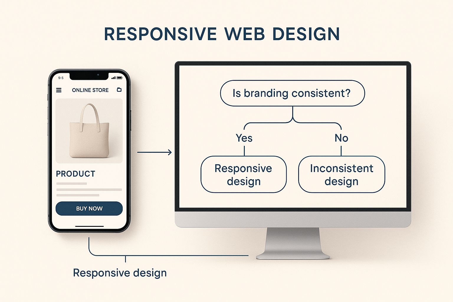
This infographic helps visualise how a responsive design should look and perform, ensuring a consistent brand experience on both desktop and mobile.
Ultimately, a seamless user experience across all devices is a non-negotiable part of modern ecommerce, influencing everything from customer satisfaction to search engine rankings.
An ecommerce platform is a strategic business partner, not just a tool. The right choice empowers growth with a stable, flexible foundation, while the wrong one can create constant technical headaches and limit your potential.
Here in Australia, the investment in a new website reflects these choices. The cost of developing ecommerce websites varies massively depending on how complex the build is. Basic sites typically cost between AUD 22,000 to AUD 28,000, whereas more advanced platforms with custom features can range from AUD 25,000 to AUD 70,000. This broad spectrum covers the platform choice, catalogue size, and the integration of mobile-friendly designs.
Designing a Seamless Customer Shopping Journey
A stunning website is only half the battle. If customers arrive at your beautiful digital storefront only to find it confusing, slow, or frustrating, they’ll leave without a second thought. This is where an exceptional User Experience (UX) becomes the driving force behind a successful e-commerce web design, turning visual appeal into tangible sales.
Crafting this experience means mapping out the entire customer journey, from the moment they land on your site to the final click of the "Confirm Order" button. It’s about anticipating their needs, removing obstacles before they become frustrating, and building confidence every single step of the way.
Think of it as designing the perfect retail store. You wouldn't hide your best-selling items in a back corner or make the checkout counter impossible to find. Online, this translates to optimising every interaction to be as smooth and intuitive as possible.
Optimising the Path to Purchase
The journey a customer takes through your online store is rarely a straight line, but you can definitely pave the way to make it feel effortless. The goal is to reduce friction—any element that causes hesitation, confusion, or annoyance. Every click should feel logical and bring the customer one step closer to their goal.
One of the most critical areas for this is your site's performance. A slow-loading page is the digital equivalent of a locked door. Research shows that even a one-second delay in page load time can cause a 7% reduction in conversions. For an Australian business, this means making sure your site is on reliable servers and that your images are compressed for speed without sacrificing quality.
This seamless experience is built on a few key pillars:
Intuitive Product Discovery: Customers need to find what they're looking for, fast. This comes down to clear navigation menus and a search function that actually works.
Helpful Filtering Options: Allowing users to sort products by price, size, colour, or popularity empowers them to narrow their choices efficiently.
Compelling Calls-to-Action (CTAs): Buttons like "Add to Cart" or "Buy Now" have to be clear, concise, and visually prominent to guide the next step.
Streamlining the All-Important Checkout
The checkout process is where a huge number of potential sales are lost. A complicated, lengthy, or untrustworthy checkout is a primary cause of cart abandonment. Simplifying this final step is one of the most impactful improvements you can make.
Every single field you ask a customer to fill out is a potential point of friction. To protect your conversion rates, it's vital to implement effective strategies to reduce cart abandonment.
The ideal checkout should feel secure and dead simple. This means offering guest checkout options, displaying trust signals like security badges, and breaking the process into a few logical steps. For a deeper dive, exploring expert tips for your e-commerce checkout can provide actionable strategies to nail this crucial final stage.
The goal is to make buying from you easier than leaving. Every small UX improvement, from faster page loads to a simpler form, contributes to a customer journey that feels less like a task and more like a great service.
Building Confidence at Every Turn
Beyond pure functionality, a great user journey builds trust. This is all about transparency and clear communication.
Consider these confidence-building elements:
Clear Shipping Information: Be upfront about shipping costs and estimated delivery times. Surprises at checkout are a massive conversion killer.
Accessible Customer Support: Make it easy for customers to ask questions, whether that's through a chatbot, email, or a clearly visible phone number.
Hassle-Free Returns Policy: A straightforward and fair returns policy reassures customers that they are making a risk-free purchase.
Ultimately, designing a seamless shopping journey is about empathy. By putting yourself in your customer's shoes and meticulously refining each interaction, you create an online store that not only works flawlessly but also builds the loyalty needed for long-term success.
Weaving SEO into Your Web Design from Day One
Thinking about Search Engine Optimisation (SEO) after your website is already built is one of the most common and costly mistakes a business can make. Real success in ecommerce comes from weaving SEO into the very fabric of your site, right from the first design sketch.
It’s like building a house. You wouldn’t put the walls up and then try to add the foundation, would you? The same logic applies here.
This approach ensures every design choice you make actively supports your ultimate goal: being found on Google. Every element, from your page layout to the way you name your image files, can either help or hinder your online visibility. Building with SEO in mind from the start creates a powerful, lasting advantage.
Building a Search-Friendly Site Architecture
A logical site architecture is the blueprint for your online store. It’s what tells search engines how all your pages relate to one another. If Google’s crawlers can't easily figure out your site's structure, they’ll struggle to index your products properly. That means customers searching for exactly what you sell might never find you.
Think of it like organising the aisles in a supermarket. Your homepage is the main entrance, leading customers to broad categories (like ‘Womens Clothing’). These then branch out into subcategories (‘Dresses’, ‘Tops’), and finally to individual product pages. This clear, predictable hierarchy makes it simple for both shoppers and search engines to navigate.
A well-planned structure also helps distribute link equity (or "SEO juice") across your site. Authority flows from your most powerful pages, like your homepage, down to your product pages, giving their individual ranking potential a serious boost.
Page Speed and Mobile Responsiveness as Ranking Factors
In the world of SEO, speed isn't a feature—it's a necessity. Slow-loading pages are a one-way ticket to a poor user experience. Visitors get frustrated and leave, which sends a strong signal to Google that your site isn’t worth recommending. The result? Slow sites get penalised in search rankings.
Mobile responsiveness is just as critical. The vast majority of online traffic now comes from smartphones, so Google rightly prioritises websites that work flawlessly on mobile. If your store is a clumsy, hard-to-use mess on a small screen, your rankings will suffer, no matter how amazing your products are.
To stay competitive, you have to get the technical performance right. A great starting point is understanding how to begin catering for Google Core Web Vitals, which will put you on the path to a faster, more responsive website that both users and search engines love.
Optimising On-Page Elements for Visibility
Beyond the technical framework, the actual content on your pages plays a huge role in your SEO success. These on-page elements are your direct line of communication with search engines, telling them exactly what each page is about.
Here are the core elements to get right:
Keyword-Rich Titles and Descriptions: Your product titles and meta descriptions need to include the relevant keywords your customers are actually typing into Google.
Unique Product Descriptions: Never just copy and paste the manufacturer's descriptions. Write your own unique, compelling copy that sells the benefits and naturally includes your target keywords.
Optimised Image Alt-Text: Alt-text is what describes your images to search engines. Use descriptive, helpful alt-text for all your product photos to help them show up in image search results.
For dynamic ecommerce sites that are constantly adding new products or running promotions, learning about faster SEO with instant indexing can give you a massive edge. It ensures your latest products get seen by search engines almost immediately.
Australian Ecommerce Design Trends to Watch
To keep your customers coming back, your ecommerce store needs to feel fresh and in sync with how people shop today. The online retail world moves fast, and Aussie consumers are savvy—they’ll quickly gravitate towards stores that offer a slick, intuitive, and genuinely enjoyable experience. A modern design isn't just about looking good; it tells shoppers your brand is current and pays attention to what they want.
Keeping up with trends isn't about jumping on every new fad. It’s about understanding the real shifts in technology and user behaviour that are shaping online shopping. Weaving these elements into your site can make a huge difference in how customers see your brand and interact with your products.
Embracing Minimalism and Clean Layouts
One of the biggest shifts we’re seeing is a strong move towards minimalism. Clean, uncluttered layouts are no longer just a style choice; they’re becoming the benchmark for high-performing ecommerce sites. This approach is all about cutting out the noise and putting the spotlight exactly where it should be: on your products.
Think generous white space, clean typography, and a simple colour scheme. This isn't just about aesthetics; it creates a focused shopping environment that makes your product photos shine. It guides the customer's eye straight to the important stuff, like product details and the "Add to Cart" button. This clarity doesn't just look professional—it smooths out the path to purchase, which is a clear win for conversions.
The Rise of Functional Dark Mode
Dark mode has officially gone mainstream. What started as a niche feature for tech enthusiasts is now something many users expect. Offering a dark theme isn't just a cool gimmick; it's a functional upgrade that improves user comfort. It’s easier on the eyes, especially in low light, and it can even help save a bit of battery life on mobile devices.
For Aussie brands, adding a dark mode option is a simple way to show you’re thinking about your customer's experience. Giving them that extra bit of control helps build a stronger connection with your brand.
An effective ecommerce web design anticipates user needs by providing a more comfortable, intuitive, and memorable shopping journey. Trends like dark mode and micro-interactions are not just cosmetic; they are practical tools that build customer trust and encourage repeat business.
Engaging Micro-interactions and AR
Tiny, purposeful animations, or micro-interactions, are making a massive impact. Think about that satisfying little bounce when you add an item to your cart, or a button that subtly changes colour when you hover over it. These small moments of feedback make a site feel alive and responsive, confirming to the user that their actions are working.
Looking a little further ahead, Augmented Reality (AR) is poised to completely change how we view products online. This tech lets customers use their phone's camera to see how a new sofa might look in their living room, or how a pair of sunnies fits their face. While it's still finding its feet, AR is an incredibly powerful tool for closing the gap between online and in-store shopping, giving customers the confidence they need to click "buy".
Ultimately, standout Aussie businesses are embracing trends like minimalist layouts, dark mode, and engaging micro-interactions to create better customer experiences and boost sales. To get a deeper dive, you can find more insights about the top ecommerce web design trends in Australia on ausdroid.net.
Common Ecommerce Design Questions Answered
When you're diving into an ecommerce project, a few big questions always seem to pop up first. For Australian business owners, getting a handle on the costs, timelines, and priorities right from the start can save a lot of headaches down the track.
Let's talk budget. It's the number one concern for most people. In Australia, a straightforward ecommerce site using a template can get you started for around $5,000 to $15,000. But if you're after a custom-built store with specific features and integrations, you're looking at a range of $25,000 to over $70,000, all depending on how complex your needs are.
Timelines and Mobile Design
"How long will it take?" is another classic. A simple, template-based website can often be up and running in 4 to 8 weeks. On the other hand, a fully custom build is a much bigger undertaking, typically taking 3 to 6 months—sometimes longer once you factor in detailed strategy, design, development, and thorough testing.
Finally, people often ask if designing for mobile-first is really that important. The answer is a massive, unequivocal yes. With over 60% of all online traffic now coming from smartphones, a mobile-first approach isn't just a good idea; it's essential.
If your site isn't built for a great phone experience, you're deliberately turning your back on the majority of your potential customers. It's that simple.
At Titan Blue Australia, we build high-performance ecommerce websites designed to convert. With over 25 years of experience, we deliver digital solutions that drive growth. Start your project with us today.
Titan Blue is your go-to digital partner for smart, results-driven solutions. We blend strategy, creativity and tech to grow your brand and get real results fast.