Stay ahead with the latest tips, trends, and insights from the Titan Blue team , straight from the studio in Broadbeach.

TL;DR:
- Mobile-friendly design must ensure fast loading, easy navigation, and clear calls to action.
- A poorly optimized mobile site can increase bounce rates and decrease conversions significantly.
- Continuous, user-driven improvements are more effective than one-time technical fixes for mobile success.
Most small business owners assume their website is fine on mobile because it loads without crashing. That assumption is costing them customers every single day. Your website might technically open on a phone, but if it is slow, cluttered, or hard to navigate, visitors leave within seconds and they do not come back. The real opportunity in mobile-friendly design is not just about being visible on phones. It is about turning those mobile visitors into enquiries, bookings, and sales. This guide breaks down exactly what mobile-friendly design means, what it looks like in practice, and how to use it to grow your business.
Table of Contents
- What is mobile-friendly design?
- Key features of mobile-friendly websites
- How mobile-friendly design drives real business results
- Getting started: steps to optimise your site for mobile
- Why most mobile-friendly advice misses the real challenge
- How we can help you create a mobile-friendly online presence
- Frequently asked questions
Key Takeaways
| Point | Details |
|---|---|
| True definition | Mobile-friendly design means fast, simple, and action-focused experiences for mobile visitors. |
| Core features | Responsive layout, clear navigation, and visible calls to action are vital for every device. |
| Business value | Mobile optimisation reduces bounce rates and directly boosts leads and sales. |
| Practical approach | Start with responsive design, prioritise user needs, and test regularly on real phones. |
What is mobile-friendly design?
Most business owners hear “mobile-friendly” and picture a website that simply displays on a phone screen without breaking apart. That is a very low bar. Real mobile-friendly design means your site actively works for your visitors when they are on a mobile device, not just around them.
According to Google’s definition, mobile-friendly design is the practice of making a website work well on mobile phones by ensuring it loads quickly, is easy to navigate, and is easy for visitors to take the next action, such as finding information or contacting you. Notice that definition does not say “displays on mobile.” It says works well. That distinction matters enormously for Australian small businesses.
“A site being technically accessible on mobile is the minimum. Mobile-friendly design means the entire experience, from loading to action, is built around what a phone user actually needs.”
Think about your own behaviour when you search for a service on your phone. You open a result, and if the page takes more than a couple of seconds or you cannot find what you need immediately, you hit the back button. Your potential customers behave exactly the same way.
The three core pillars of mobile-friendly design are:
- Fast loading: Pages should load in under three seconds. Slow pages are the single biggest driver of mobile abandonment.
- Easy navigation: Menus, buttons, and links must be easy to tap and logically arranged so visitors find what they need without confusion.
- Clear calls to action: Whether it is a phone number, a booking button, or a contact form, the next step must be obvious and immediately accessible.
Following established mobile-friendly website practices is not optional for businesses that want to compete online. It is the foundation of every effective digital strategy. When your site fails on any of these three pillars, you are losing visitors before you even get a chance to show them your value.
Research shows visitors are 5x more likely to leave a site that is not mobile-friendly. That is not a small margin. For every 100 mobile visitors landing on a poorly designed site, you could be converting 80 of them into bounced traffic.
Key features of mobile-friendly websites
With a clear definition established, let’s discover what sets a mobile-friendly website apart from a frustrating one. The gap between the two is often smaller than you think, but the business impact is significant.
A truly mobile-friendly site reduces friction so users can quickly find information and complete actions on a phone. That means every design decision, from font size to button placement, should serve that goal. Here is a direct comparison of what separates the two:

| Feature | Mobile-friendly site | Mobile-unfriendly site |
|---|---|---|
| Page load time | Under 3 seconds | 5 seconds or more |
| Text size | Readable without zooming | Too small, requires pinching |
| Button size | Easy to tap with a thumb | Too small, causes mis-taps |
| Navigation | Simple, collapsible menu | Desktop-style, cluttered |
| Images | Compressed, fast-loading | Large, slow to load |
| Forms | Short, easy to complete | Long, difficult on small screens |
| Contact details | Click-to-call enabled | Plain text only |
The differences above translate directly into whether a visitor stays or leaves. Here is how each feature supports your visitors and your business:
- Responsive layout: A responsive design automatically adjusts your site’s layout to fit any screen size. This means one website works perfectly across phones, tablets, and desktops without a separate mobile site. The responsive design benefits extend beyond user experience into SEO performance as well.
- Readable text: If visitors have to zoom in to read your content, they will not. Use a minimum font size of 16 pixels for body text on mobile.
- Accessible buttons: Touch targets should be large enough to tap comfortably with a thumb. Small buttons frustrate users and lead to errors, which drives abandonment.
- Minimal unnecessary scrolling: Place your most important content and calls to action near the top of the page so visitors see them without scrolling far.
- Optimised images: Compress images without sacrificing quality. Large image files are one of the most common causes of slow mobile load times.
Following steps to mobile-friendliness in a structured way ensures you do not miss critical elements that affect how your site performs.
Pro Tip: Touch target size is often overlooked but has a measurable impact on conversions. Buttons smaller than 44 x 44 pixels are frequently mis-tapped on mobile devices, which frustrates users and increases the chance they abandon your site entirely. Review every button and link on your mobile site and increase their size if needed.
How mobile-friendly design drives real business results
Understanding the features is only valuable if you see the results. Let’s review the real-world business impact.
Google emphasises that on mobile, users expect answers right away and that ease of navigation and ability to take action strongly influence the likelihood someone becomes a customer. This is not about aesthetics. It is about revenue.
When your mobile site loads quickly, visitors are more likely to stay, explore your services, and contact you. When it is slow or confusing, the opposite happens. The relationship between website speed for conversions and your bottom line is direct and measurable.
Here is how mobile performance affects the key metrics that matter to your business:
| Metric | Mobile-friendly site | Non-mobile-friendly site |
|---|---|---|
| Bounce rate | 20 to 40% | 60 to 90% |
| Time on site | 2 to 4 minutes | Under 30 seconds |
| Conversion rate | 3 to 5% | Under 1% |
| Return visitor rate | Higher | Significantly lower |
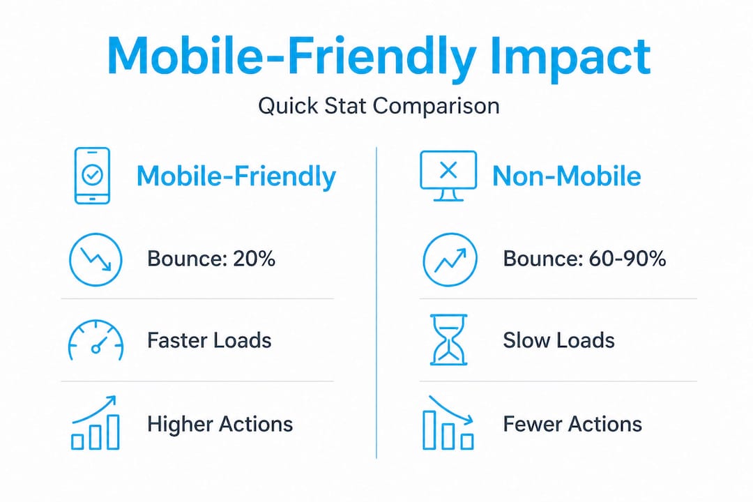
These numbers represent real leads and real revenue. A bounce rate of 80 to 90% on your mobile site means roughly 8 or 9 out of every 10 visitors are leaving without taking any action. That is a significant loss.
The business KPIs most directly impacted by mobile-friendly design include:
- Bounce rate: Poor mobile experience sends visitors straight back to the search results, increasing your bounce rate and signalling poor quality to Google.
- Lead volume: If your contact form is hard to fill out on a phone, or your phone number is not click-to-call, you are creating unnecessary barriers to enquiry.
- Revenue: Fewer leads means fewer sales. The maths is straightforward.
- Search ranking: Google uses mobile experience as a ranking signal. A poor mobile site can push you lower in search results, reducing your traffic before visitors even land on your site.
- Customer trust: A site that looks broken or outdated on mobile damages your credibility. First impressions matter, and for many customers, your mobile site is that first impression.
Investing in user experience in web design is one of the highest-return improvements a small business can make to its digital presence. The cost of improvement is far lower than the cost of the leads you are currently losing.
Getting started: steps to optimise your site for mobile
Now you know the business impact, so how do you actually make your website mobile-friendly? The good news is you do not need to start from scratch or spend a fortune. A structured approach will take you from where you are now to a significantly better mobile experience.
Responsive design using a single URL and the same core HTML is the recommended starting point, followed by verifying that the mobile experience supports fast loading, simple navigation, and clear calls to action. Here is how to do that in practice:
- Audit your current mobile experience: Open your website on your phone right now. Note everything that is difficult, slow, or confusing. Ask a friend or family member to do the same and note their experience. Fresh eyes reveal problems you have become blind to.
- Switch to a responsive theme or framework: If your site is not already responsive, this is your most important first step. Most modern website platforms offer responsive templates that handle layout adjustment automatically. See the mobile-first web design guide for a thorough explanation of mobile-first indexing and why building for mobile first is now the standard.
- Prioritise your core actions: Decide what you want mobile visitors to do. Call you? Fill out a form? Book an appointment? Make that action prominent and easy to complete above the fold, meaning visible without scrolling.
- Compress your images and remove unnecessary scripts: Use tools like Google PageSpeed Insights to identify what is slowing your site down. Image compression and removing unused plugins or scripts can dramatically improve load times.
- Test after every change: Do not assume a change worked. Test it on multiple devices and browsers. Google’s free Mobile-Friendly Test tool gives you a quick result with specific issues flagged.
- Track your metrics: Set up or review your Google Analytics data before and after changes. Monitor bounce rate, session duration, and conversion rate on mobile devices specifically.
Improving SEO and site performance together produces compounding results. A faster, easier mobile site ranks better, attracts more traffic, and converts more of that traffic into leads.
Pro Tip: Do not try to fix everything at once. Pick the single biggest issue identified in your audit and fix that first. Small, focused improvements often produce quicker gains than trying to redesign your entire site in one go.
Why most mobile-friendly advice misses the real challenge
Here is an honest observation after working with Australian businesses across many industries: most guides on mobile-friendly design treat it like a compliance exercise. Tick the boxes, pass the test, move on. That approach gets you a site that passes a technical audit but still fails real users.
The goal is not only technical correctness, but reducing friction so users can quickly find information and complete actions on a phone. Technical correctness is achievable in an afternoon. Reducing friction for real users is an ongoing process.
The businesses that win on mobile are not the ones with the largest budgets or the most sophisticated technology. They are the ones that actually understand how their customers use their site. What are they searching for? What questions do they have? What stops them from picking up the phone or submitting a form?
The uncomfortable truth is that many small business owners have not sat down and genuinely used their own website on a phone in months, possibly years. Their website reflects what they thought their customers needed when the site was built, not what those customers actually need today.
Checklists are useful starting points. But they do not tell you that your booking form asks for too much information upfront and that is why visitors abandon it. They do not reveal that your most popular service page is buried three clicks deep. Only talking to your customers and watching how they actually behave on your site gives you that insight.
Our experience with website design tricks for businesses consistently shows that small, user-driven improvements outperform sweeping redesigns. A single change, like moving a phone number to the top of the page or reducing a form from eight fields to three, can double enquiries from mobile visitors. That is not an exaggeration. It is what happens when you solve a real problem for a real user instead of ticking a technical box.
How we can help you create a mobile-friendly online presence
If this article has made you think about your website differently, that is exactly the point. Mobile-friendly design is not a one-time task. It is an ongoing commitment to giving your visitors the best possible experience on whatever device they are using.

At Titan Blue, we build conversion-focused, mobile-optimised websites for Australian businesses that want to turn traffic into real results. Our team starts with your goals, your customers, and your current site performance before making a single recommendation. We offer professional Gold Coast web design backed by real digital marketing expertise, so your site does not just look good on mobile. It performs. Whether you need a full rebuild or targeted improvements to your existing site, we can help you identify exactly where you are losing visitors and what to do about it. Explore our approach to better website user experience or take a look at our complete website design guide to see what is possible. Get in touch today for a no-obligation consultation and let us audit your site together.
Frequently asked questions
What is the difference between mobile-friendly and responsive design?
Mobile-friendly design means your site works well on any mobile device, while responsive design is a specific technical approach where your site layout adapts automatically to many different screen sizes using a single URL and shared HTML.
How do I know if my website is mobile-friendly?
Use Google’s free Mobile-Friendly Test tool to get an immediate result, or simply open your site on your smartphone and check whether it loads quickly and is easy to navigate and take action on.
Does Google penalise non-mobile-friendly websites in search rankings?
Yes. Google uses mobile UX as a ranking factor, so sites that perform poorly on mobile devices can rank lower in search results, directly reducing the traffic you receive.
What is the easiest first step to make my site mobile-friendly?
Switch to a responsive design theme or template so your layout adjusts automatically to any screen size, then ensure your most important information and calls to action are visible without zooming or scrolling.
Recommended

SEO vs AEO vs GEO: What’s the Difference and Which Does Your Australian Business Need?
SEO, AEO, and GEO are three distinct but complementary disciplines. This guide explains each one,…

The Complete AI SEO Glossary: Every Term Australian Businesses Need to Know in 2026
Plain-English definitions of every AI SEO, AEO, and GEO term — from RAG and entity…
How AI Search Engines Work: The 5-Stage Pipeline Behind ChatGPT, Perplexity, and Google AI Overviews
AI search engines use a five-stage pipeline — fan-out, retrieval, passage scoring, LLM synthesis, and…