Stay ahead with the latest tips, trends, and insights from the Titan Blue team , straight from the studio in Broadbeach.

TL;DR:
- Responsive web design automatically adjusts layouts, images, and navigation for all devices.
- It improves user experience, reduces bounce rates, and increases conversions on mobile devices.
- Google favors responsive sites, which enhances search rankings and consolidates SEO link equity.
Your website might look great on a desktop, but if it falls apart on a phone, you are already losing customers. Non-responsive sites lose 73% of visitors before they even read a single word. For Australian small and medium-sized businesses competing for attention online, that is not a minor inconvenience. That is real revenue walking out the door. Responsive web design is the fix, and this article will show you exactly how it improves user experience, lifts your Google rankings, drives conversions, and saves you money over the long run.
Table of Contents
- Understanding responsive web design and why it matters
- How responsive web design impacts user experience and conversions
- SEO benefits: responsive design and Google rankings
- Responsive versus adaptive design: what’s the right choice for your business?
- Why most advice on responsive web design for SMBs misses the mark
- Unlock the power of responsive web design with our team
- Frequently asked questions
Key Takeaways
| Point | Details |
|---|---|
| Boosts search rankings | Google rewards responsive sites with higher search visibility and easier indexing. |
| Increases sales and leads | Mobile-friendly design can lift conversion rates up to 40% for Australian businesses. |
| Saves time and money | Managing one responsive site costs less in the long run than separate mobile and desktop sites. |
| Improves user satisfaction | Visitors stay longer and are more likely to interact with fast, easy-to-use sites on any device. |
Understanding responsive web design and why it matters
Most business owners assume their website works on mobile because it loads on a phone. That is not the same thing. A website that simply loads on a small screen is not responsive. Responsive web design means your website automatically adjusts its layout, images, text sizes, and navigation to suit whatever device someone is using, whether that is a smartphone, tablet, laptop, or widescreen monitor.
Here is how it actually works. Responsive design uses flexible grids and proportional measurements rather than fixed pixel widths. Images scale fluidly. Menus collapse into touch-friendly formats. Text reflows so readers do not have to zoom and pan just to read a sentence. The result is a seamless experience regardless of screen size.
The difference between “mobile-friendly” and “responsive” matters more than most people realise. A mobile-friendly site might just be a scaled-down version of a desktop page. It could still have tiny buttons, overlapping text, or images that break the layout. A genuinely responsive site is built from the ground up to serve every user on every device without compromise.
In Australia, this is not optional. Over 93% of Australians access the internet via mobile devices. That means the vast majority of people visiting your website are doing so from a phone. If your site is clunky on mobile, you are failing most of your audience before they have had a chance to learn what you do.
Here is what responsive design actually controls on your site:
- Layout: Column structures shift from multi-column on desktop to single-column on mobile
- Images: Photos and graphics resize proportionally rather than overflowing or shrinking awkwardly
- Navigation: Dropdown menus convert to hamburger-style menus suited to touch screens
- Typography: Font sizes and line spacing adjust for comfortable reading without zooming
- Buttons and forms: Touch targets become larger and more accessible on smaller screens
- White space: Padding and margins scale to keep content readable and uncluttered
Pro Tip: Build your site with a mobile-first mindset. Design the mobile layout first, then scale up to desktop. Use modern CSS techniques like "clamp()` for fluid typography and container queries for component-level responsiveness. This approach leads to leaner, faster code and a far better experience across all devices. Pair this with our mobile-first web design guide to put these principles into practice straight away.
How responsive web design impacts user experience and conversions
Understanding responsive design is one thing. Seeing what it actually does for your customers and your revenue is another.
When someone visits your website on a phone, their behaviour is different from a desktop user. They are often on the move, with limited patience. They want fast answers, easy navigation, and clear calls to action. They are not going to pinch and zoom their way through a broken layout. They will simply leave and find a competitor who made the effort.
The numbers confirm this. Non-responsive sites lose 73% of visitors immediately. Mobile users are 67% more likely to buy from a site that is mobile-friendly. And bounce rates are 12% higher on non-responsive sites, meaning more visitors leave without taking any action at all.
“People are 67% more likely to buy from a mobile-friendly website. If your site is not responsive, you are handing those sales to your competitors.”
Here is exactly how a responsive site improves the journey for every visitor:
- Fast, clean loading: A well-built responsive site loads quickly because it serves appropriately sized assets for each device. A mobile user does not receive desktop-sized images that take ages to download on a mobile connection.
- Intuitive navigation: Menus are designed for thumbs, not mouse cursors. Visitors can find what they need without frustration or accidental clicks.
- Readable content: Text is sized correctly without requiring manual zooming. Visitors can read your offer, understand your services, and make informed decisions quickly.
- Clear calls to action: Buttons like “Call Now,” “Request a Quote,” or “Shop Now” are prominently placed and large enough to tap comfortably, reducing friction between intent and action.
- Consistent brand experience: Whether someone sees your site on a phone or a desktop, they get the same quality impression of your business. Consistency builds trust.
The impact on user experience and conversion is direct. Every barrier you remove from the mobile experience is a step toward a completed purchase, a submitted enquiry, or a phone call. Likewise, every frustration you leave in place is a reason for a potential customer to leave.

Reducing bounce rates is equally important for your search rankings, which brings us to the next major benefit of responsive design.
SEO benefits: responsive design and Google rankings
Google made a decisive shift to mobile-first indexing several years ago, and it has not looked back. What this means in practice is that Google primarily uses the mobile version of your website to determine how it ranks in search results. If your mobile site is poor, your rankings will suffer, regardless of how polished your desktop site looks.
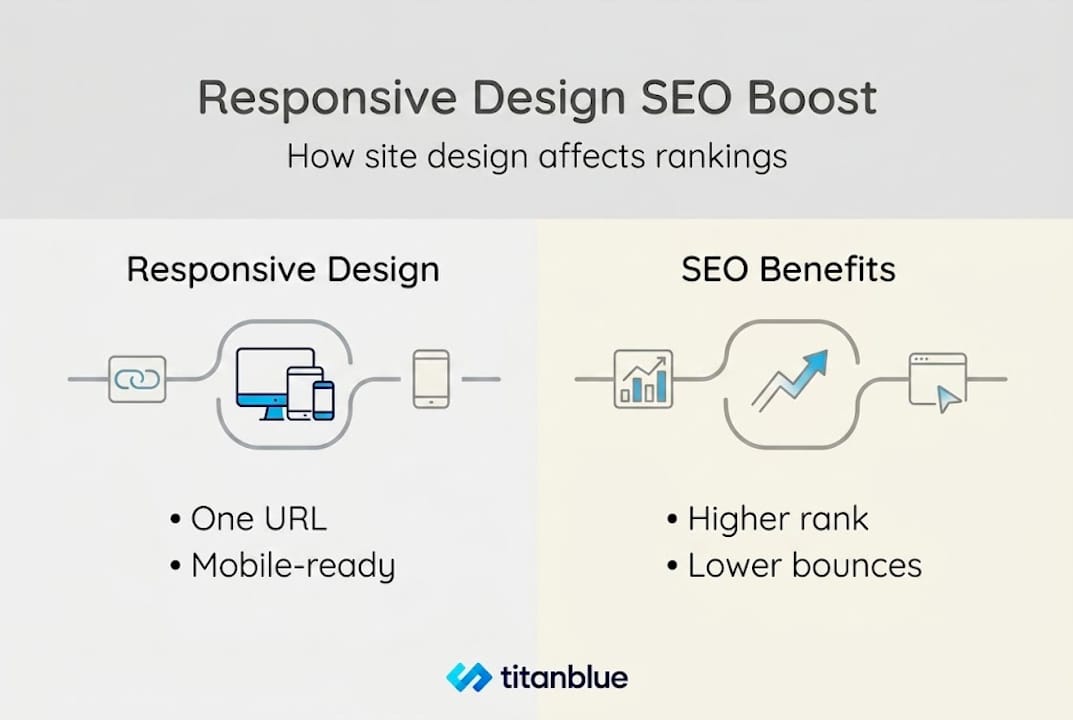
Google prefers responsive sites because they use a single URL for all devices. This makes your site far easier for Google’s crawlers to find, index, and rank. With separate desktop and mobile sites, or redirect-based “m-dot” configurations, you create unnecessary complexity. Duplicate content issues, inconsistent metadata, and crawl budget waste all become problems. Responsive design sidesteps every one of these pitfalls.
Here is a direct comparison of what responsive and non-responsive setups mean for your SEO:
| SEO factor | Responsive site | Non-responsive site |
|---|---|---|
| URL structure | Single URL for all devices | Often multiple URLs (e.g., m.yourdomain.com) |
| Crawlability | Easy, one version to crawl | More complex, split crawl budget |
| Indexing | Fast, consistent indexing | Risk of inconsistent or delayed indexing |
| Duplicate content risk | Minimal | Higher risk from separate mobile/desktop content |
| Mobile-first ranking signal | Strong positive signal | Weak or negative signal |
| Page speed (Core Web Vitals) | Optimised for all devices | Often poor on mobile |
| Link equity | Consolidated on one URL | Split across multiple URLs |
The table makes it clear. A responsive site is not just better for users. It is structurally superior for search engines. That translates directly into better visibility, more organic traffic, and lower reliance on paid advertising to generate leads.
Pro Tip: Responsive design also protects your link equity. When other websites link to you, all of that authority flows to a single URL. With separate desktop and mobile URLs, that authority gets diluted. A responsive site keeps your SEO for small business efforts working as efficiently as possible.
If you want to understand the full scope of what search engine optimisation can do for your business, the principles are well covered in SEO explained for Australian businesses. And if you are ready to act, reviewing SEO strategies for Australian businesses will show you how responsive design fits into a broader ranking strategy.
Responsive versus adaptive design: what’s the right choice for your business?
You may have heard the term “adaptive design” used alongside responsive design. They are related concepts, but they work quite differently. Understanding the distinction helps you make a smarter investment decision for your website.
Responsive design uses fluid grids and flexible elements that adapt continuously to any screen size. Adaptive design takes a different approach. It creates several fixed layouts, each built for a specific screen size or device category. When a user visits, the server detects their device and delivers the matching layout.
Adaptive design can produce very precise, polished results for specific devices. Large enterprises with dedicated development teams sometimes use it because it allows pixel-perfect control over the experience on each device type. However, adaptive design is more complex and costly to build and maintain, requiring separate designs, separate testing, and separate updates for each device layout.
Here is a practical comparison for Australian SMBs considering both options:
| Factor | Responsive design | Adaptive design |
|---|---|---|
| Cost to build | Lower | Significantly higher |
| Maintenance effort | Single codebase to maintain | Multiple layouts to maintain |
| SEO friendliness | Strong, single URL | More complex, potential duplicate content |
| Mobile user experience | Excellent across all devices | Excellent, but only for targeted devices |
| Future device compatibility | Automatically accommodates new screen sizes | May need updates for new devices |
| Development complexity | Moderate | High |
| Recommended for SMBs | Yes | Generally not |
Adaptive design might be worth considering in these specific circumstances:
- Your business has a very specific, known device audience (for example, a kiosk or point-of-sale application)
- You require highly specialised functionality that differs significantly between desktop and mobile
- You have a dedicated in-house development team to manage ongoing maintenance
- Budget is not a primary constraint and performance optimisation for individual devices is critical
For the vast majority of Australian small and medium-sized businesses, responsive design is the practical and strategic choice. It costs less to build, less to maintain, and performs better in Google’s eyes. Our website design guide covers the technical foundations in detail if you want to explore further before committing to a direction.
Why most advice on responsive web design for SMBs misses the mark
Here is the uncomfortable truth most how-to guides will not tell you. Responsive design is not a one-time job. Getting a responsive site built is the beginning, not the end.
Most agencies will hand you a site that looks correct on the day of launch. Then six months later, new device sizes have emerged, you have added new content, and nobody has tested whether the experience still holds up. Responsive design requires ongoing attention. Tap targets drift. Images break. New plugins introduce layout conflicts. Businesses that treat their website as a set-and-forget asset are the ones who quietly lose traffic and wonder why.
There is also a tendency in the industry to overcomplicate things. Agencies charge more for complexity. But in most cases, simpler, well-structured code built with modern CSS outperforms overbuilt frameworks. We have seen businesses with heavily customised, expensive sites converted to clean, going mobile-first architecture and experience noticeable conversion uplifts from something as simple as correcting tap target sizes or fixing a broken image on a 390px screen.
Mobile-first is a business mindset, not just a technical instruction. It means asking, constantly, how is this experience for someone on a phone? That question should drive every content decision, every design choice, and every campaign you run. Businesses that genuinely adopt this mindset see results. Those who treat it as a box-ticking exercise do not.
Unlock the power of responsive web design with our team
You now know what responsive design is, why it matters, and how it directly impacts your rankings, user experience, and revenue. The next step is making it happen for your business.

At Titan Blue, we build websites that are responsive from the ground up, designed to convert visitors into customers across every device. Our team is based on the Gold Coast and works with small and medium-sized businesses across Australia to deliver sites that perform, not just look good. Whether you need a brand-new web design Gold Coast solution or want to improve your existing site’s performance, we can help. Explore our website user experience solutions and get in touch to start a conversation about what your site could be doing better.
Frequently asked questions
How does responsive web design improve my Google ranking?
Google uses mobile-first indexing, meaning it primarily evaluates the mobile version of your site when determining rankings. Responsive design improves SEO because a single URL structure is easier for Google to crawl and index consistently, giving your site a stronger ranking signal.
What is the main difference between responsive and adaptive web design?
Responsive design adapts fluidly to any screen size using one flexible codebase, while adaptive design serves fixed layouts built for specific devices. Adaptive design offers better control per device but involves significantly higher cost and complexity, making responsive the preferred choice for most SMBs.
Does having a responsive website cost more?
A responsive site typically costs less over time compared to building and maintaining separate desktop and mobile versions. Responsive design simplifies maintenance with a single codebase and avoids the ongoing expense of keeping multiple site versions updated and aligned.
How much can responsive design boost my sales or conversions?
Australian small businesses can realistically see an 11 to 40% uplift in conversions after switching to a properly built responsive site, driven by better mobile usability, faster load times, and reduced friction in the buying process.
Why do so many visitors leave non-responsive websites?
Non-responsive websites are difficult to use on mobile devices, with small buttons, unreadable text, and slow load times. Non-responsive sites lose 73% of visitors immediately because the experience is too frustrating to continue with, regardless of how relevant the content might be.
Recommended

Perplexity vs ChatGPT Search Optimisation: How Each AI Platform Cites Your Content Differently
Perplexity and ChatGPT use fundamentally different citation mechanisms. This guide compares both platforms and provides…

How to Optimise FAQ Pages for AI Search: The Complete 2026 Guide for Australian Businesses
Learn how to structure FAQ pages so ChatGPT, Google AI Overviews, and Perplexity can parse,…

How to Add Schema Markup for AI Search: A Step-by-Step Guide for Australian Businesses
Learn how to implement schema markup that helps AI engines like Google AI Overviews, ChatGPT,…